Showing posts with label memento ink pad. Show all posts

Monday, 9 July 2012

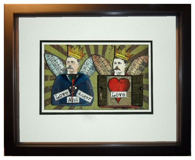
Love and Anger

This weeks theme on the Simon Says Stamp and Show Challenge is "Layered". My piece this week is inspired by one of my favorite songs, Love and Anger by Kate Bush.

The specific part of the lyrics that were running through my mind when I created this piece was:
It lay buried here, it lay deep inside me, it's so deep I don't think that I can speak about it to anyone.  It could take me all my life, but it would only take a moment to tell you what I'm feeling.
If you're unfamiliar with the song and you'd like to check it out, you can find it here.
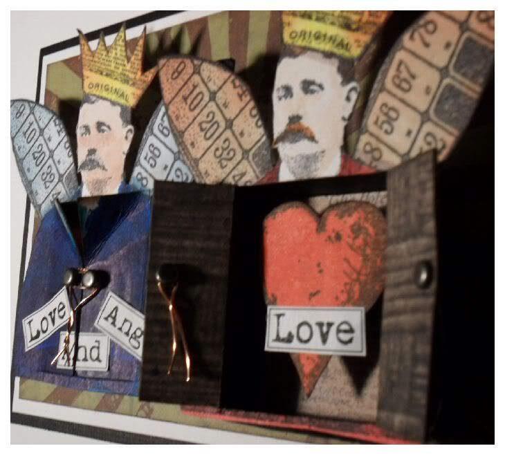

Obviously, given that this week's theme revolves around layers, I wanted to bring a lot of depth and dimension into my project.  That probably doesn't show up too well in the main photo, but hopefully the other pictures will give you an idea of the depth and layers that are included.

Ok, a quick skip through what I did...
  1. I started out by stamping and colouring the two men with promarkers, blending Distress Inks onto the edges in places.
  2. Using a craft knife, I cut open the chests to make doors.
  3. I created shallow boxes from black card, which sit behind the doors and hold the hearts.  The base of each was covered with a piece of Destinations card.
  4. The hearts were stamped and coloured then mounted on 3d foam.
  5. I used a piece from the Destinations paper stack for the rear side of the doors and added brads as the door handles.
  6. The text was printed on the computer.
  7. The background was a piece from the Retro Grunge paper stack, stamped with Tim Holtz's "rays" stamps, one of my favourites.
  8. Finally the whole piece was matted onto white, then black card.
 Luckily I had a deep enough frame to house this piece, it's probably about an inch or so deep in total!  I've also included a photo here of the red man with his doors closed, just to show that they worked, and that I did take the time to colour the parts you wouldn't normally see! lol


Supplies I used included:
InLinkz.com
Our ever-generous sponsor Simon Says Stamp is offering a $50 gift voucher as the prize again this week, just make something for the challenge and you could the winner! The winner will be chosen at random from those who enter the challenge, so why not give it a try? At the very least why not head over to the Challenge Blog to see how the other members of the design team have interpreted this weeks theme! :)


Monday, 25 June 2012

See No Evil, Hear No Evil, Speak No Evil


This weeks theme on the Simon Says Stamp and Show Challenge is "Depths of Distress".   A few days back I was watching news reports about both the Eurozone crisis and the collapse of parts of the banking industry in various places around the world and it started one or two wheels turning in my head, but then I eventually thought no more of it.  When it came time to think about this week's challenge I had this idea of making an updated version of the Japanese proverb of the 3 Wise Monkeys - "See no evil, hear no evil, speak no evil".  Luckily, in my house mansion, apart from my craft room, an entire wing of my spacious estate is devoted solely to stamps of animals and 3 of the rooms contain my entire collection of monkey stamps in various positions :)

A-n-y-w-a-y... long story short, on my way to my stampatorium I kept getting lost between my golf course and private day spa. Without access to my collection of monkey stamps, I had to abandon the monkey idea completely! That's when I thought back to the banking stuff I had been watching on tv and although they'd used different terminology, it wasn't a huge leap to realise that one thing the interviewed bankers kept implying was that they'd seen no evil, heard no evil and spoken no evil.  So there you have it, three '50s type bankers, complete with stylish modern accessories representing an update to the ancient Japanese proverb!

I spritzed the background card with a little water then dabbed on spots of Distress Stain all over it.  When it was dry I went over it with a few layers of white Distress Stain to soften the colour and stamped the Tim Holtz numbers stamp on top, finally finishing with more white Distress Stain.  I also wiped it with a baby wipe to make it a little more grainy.

I cut out the suits and hats from a sheet of Kraft Resist paper and coloured them with Distress Ink (you could also use Distress Stain but Distress Ink pad and blending tool give a much stronger contrast in the glazed areas of the Kraft Resist).  The shirts and ties were cut freehand with scissors (I didn't even draw them first, I just kept snipping until they looked right.  I know, I know, crafting without a safety net - I live life on the edge!).  The ties were coloured with Barn Door Distress Ink.

I stamped the clowns from the Big Top stamp set and cut out the central face from each image and coloured them with Promarkers.  The accessories were cut from black cardstock and I cut the ipod from black and white card and added twisted wires for the headphones.  I cut a half inch from the bottom of the two background figures so that the added height of the middle figure would make it look like the group was looming threateningly over the viewer.  The two background figures were mounted on black foam to raise them above the background, then the middle figure was further mounted above the duo behind.  I mounted the whole piece onto black card and then onto the front of a white greeting card blank.

So there you have it, a bit of crafting, a bit of Japanese religious history and a bit of topical commentary on society - what more can you want?  lol

Apology:  It has been brought to my attention that some parts of my story in the first two paragraphs are out-and-out lies - specifically in the parts that mention my home.  I've read and re-read it but try as I might I can't find anything wrong.  Still, I'd be failing in my duty, dear reader, if I didn't point it out to you!

Our ever-generous sponsor Simon Says Stamp is offering a $50 gift voucher as the prize again this week, just make something for the challenge and you could the winner! The winner will be chosen at random from those who enter the challenge, so why not give it a try? At the very least why not head over to the Challenge Blog to see how the other members of the design team have interpreted this weeks theme! :)


Monday, 14 May 2012

Famous for 15 Minutes


This weeks theme on the Simon Says Stamp and Show Challenge is "Anything Goes", so why not get creative and give this week's challenge a try?

My piece this week was inspired to some extent by the work of Andy Warhol, particularly his images in the style of this one of Marilyn Monroe. Needless to say mine is a little more grungy than his very graphic style! :)  Oh, that's also why I paraphrased his quote "in the future everyone will be famous for 15 minutes" as the title!

The two panels on the left use tissue tape as background, both taken from the Commute pack.  The lower background was coloured with distress inks applied with an ink blending tool and you can see that the colour is very subtle, tissue tape doesn't hold much colour that way.  The top panel was coloured with a distress marker which was then wiped with a wet wipe and you can see that much more of the colour has stayed visible.

The two panels on the right were stamped with Versamark ink and images from the new Tim Holtz set "Mixed Media".  I dried them with a heat gun and then applied distress inks on top, which is resisted by the Versamark, giving a ghosted image of the stamp.

Moving in a clockwise circle from top left, the men (Wendy Vecchi's stamp "Well Dressed") were coloured as follows:
  1. Distress stains, which I didn't dry between colours, so that they would run together.
  2. Uncoloured, with added white star brads.
  3. Stamped in black then over stamped in red and yellow, offsetting the image each time.
  4. Stamped and coloured with promarkers.
I think that of all the pieces I've made in recent weeks this one is by far my favourite - I hope you feel the same way too! :)

Our ever-generous sponsor Simon Says Stamp is offering a $50 gift voucher as the prize again this week, just make something for the challenge and you could the winner! The winner will be chosen at random from those who enter the challenge, so why not give it a try? At the very least why not head over to the Challenge Blog to see how the other members of the design team have interpreted this weeks theme! :)

Monday, 2 April 2012

Facing up to Studio 490!

This weeks theme on the Simon Says Stamp and Show Challenge is "Inspiration Studio 490".  Wendy Vecchi releases some fantastic stamps under her Studio 490 label, and I particularly love these faces and the distressed lines background that I used.  The background was coloured with Old Paper distress stain, and everything else was coloured with Promarkers.  As ever with Promarkers, I stamped with Memento Tuxedo Black, to avoid the stamped image bleeding when it was coloured.

Our ever-generous sponsor Simon Says Stamp is offering a $50 gift voucher as the prize again this week, just make something for the challenge and you could the winner! The winner will be chosen at random from those who enter the challenge, so why not give it a try? At the very least why not head over to the Challenge Blog to see how the other members of the design team have interpreted this weeks theme! :)

Friday, 30 March 2012

Coney Island!

Not much to say about this one really!  Some new stamps arrived today, mostly some of Tim Holtz' newbies, and I wanted to have a quick play with them, even if it was only for a few minutes before bed! :)

Tuesday, 20 March 2012

The Eyes Have It!

Just a quick card tonight! I've had this Hero Arts face stamp for well over a year and not even tried it out yet, so giving it an outing was one of my main aims. It's wood-mounted, a rarity for me, but it stamps well, which is the main thing! :)

My other aim for this post was to do the whole thing on my new iPad, even the photo editing. To be honest, I struggled a bit, simply because I'm so new to both the iPad and to Photoshop Touch, which I used to edit the photo. Still, I got there in the end and it can only get better from here! :)


Tuesday, 13 March 2012

So I bought this laser printer....

... and then it sat on my desk for almost a year, unpacked, un-setup and unloved! 

It all started some time last year, when I was lucky enough to take a two-day class with the awesome Dina Wakley at Art From the Heart.  One of the mini-book projects featured a page that used a photocopy of a photograph Dina had taken of a ruined abbey.  (I can't find the project right now, otherwise I'd show you the page!)  Anyway, I can't remember exactly what we had to do with the photocopy, but I wasn't really feeling it, so I just started to apply ink, paint and colorwash sprays to it.  As the ink on the photocopy had been heat-set during the copying process it meant that none of the black bled or ran and I was really happy with the result.

I enjoyed making the page so much that it got my mind working and I realised that a laser printer attached to my computer could be used in the same way as a photocopier and I could do more of that kind of thing at home.  Jump to a few weeks later, and I decided to research laser printer prices online, and I was shocked, (SHOCKED I tell you!) to find that a brand new Samsung laser printer could be had for around £30!!  I ordered one immediately, keen to get started with it, and then when it arrived a couple of days later, I ignored it for almost a year LOL

Last night I needed to print some music out from my computer only to find that my inkjet printer was out of ink.  (Did I tell you I've started learning the piano?  No?  Well I have.)  Having no alternative I set up the laser printer, as I was only printing black text.  Needless to say, it worked fine, and my mind started turning again to ways in which to use it in my crafting.

The alphabet stamps on this card are from an Australian stationery chain called kikki.K.  (Did I tell you I was in Australia for a month recently?  No?  Well I was.)  The woman on this card is actually a colour photograph in a book I have, which I scanned in and then tweaked to make it into a black and white image.  I printed it out and this card is the result.  I'm sure I'll do more of this in the future, so watch this space! :)

Monday, 2 May 2011

A Word in Hand

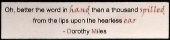
The theme for this week's Simon Says Stamp and Show Challenge is "hands" and I was immediately inspired to use a quote from a poem I've always loved.  Most of you won't know this, but I studied British Sign Language for 17 years, eventually teaching in a college for Deaf people and also doing some sign interpreting, both in the UK and overseas.  In the course of all this I made many Deaf friends, and one lady who made a big impression on me was Dorothy Miles, a Deaf poet and playright.  Sadly she's no longer with us, but her work lives on, and the quote I've used is from her poem "To a Deaf Child".  The quote reads:


"Oh, better the word in hand than a thousand spilled from the lips upon the hearless ear."


The arrangement of hands from Tim Holtz's Steampunk stamp set in the picture is almost (but not quite) an illustration of the sign for "talk", which I thought fitted with the quote nicely!

Our ever-generous sponsor Simon Says Stamp is offering a $50 gift voucher as the prize again this week! The winner will be chosen at random from those who enter the challenge, so why not give it a try? At the very least why not head over to the Challenge Blog to see how the other members of the design team have interpreted this weeks theme! :)

Friday, 1 April 2011

Watch the birdie!

 All of the stamps on this card are from a great set by Oxford Impressions, which I've had for a couple of years and only used once before, so I thought it was time they had another airing!  I used Antique Linen Distress Stain on the background, which was then knocked back with white paint, and on the "oiseau" panel too.  The mat around the edge was coloured with Vintage Photo DS.

No patterned paper on this card though, I need to stay focussed on my plan to reduce the mountain I have here! LOL

Friday, 25 March 2011

Converse Revisited

Those of you who have followed my blog for a while might feel that you've seen this card before. Well, you have....kinda. I made this card almost exactly a year ago, and a friend just asked me if I'd make one for her, but in green and blue. Always an obliging chap, here's the result! :)

I had made the background paper myself in Inkscape, so it was easy to change the colour from red to green and reprint it. It's matted on black American Crafts linen textured cardstock (basically their version of Bazill) and the shoes are stamped in Memento Tuxedo Black ink then coloured with promarkers.

As ever, click the image for a larger view. See you tomorrow! :)

Wednesday, 23 March 2011

Gingersnap Creations - "Ginger/Copper/Rust" Challenge

"Ginger/Copper/Rust" is the theme over on the Gingersnap Creations blog this week. This also marks my last project for the design team. It's been a fun (though crazy) time, with "life" getting in the way for a while, during which time I had to step down from the team for a spell. I'm so grateful that they were kind enough to give me that time when other priorities took me away from crafting temporarily!

This card has copper stars, a copper tab and brads and rusty colours so I think it qualifies! :)

I want to take this opportunity to wish the team every success for the future and hope that the team members, both new and old, have a great next 6 months! Why not pop over to the GC blog to see how the DT members have interpreted the challenge - go on, you know you want to! :)


Monday, 21 March 2011

A Word to the Wise

The theme over on the Simon Says Stamp and Show Challenge this week is "A Word". For this dream-y card I started by covering my card base with randomly placed pieces of torn tissue tape, which was then covered with espresso and red pepper paint dabbers applied with kitchen paper. The butterfly from Tim Holtz's Spring Sprung stamp set was stamped on the painted background with Memento Tuxedo Black ink, then over-painted with white paint dabber applied with an artist's paintbrush, coloured with marker pens and restamped. The piece was edged with Walnut Stain distress ink. The letters are cut from the Lost and Found card stack and covered with glossy accents for extra shine. Finally, the mat was cut from the Retro Grunge card stack.

Our ever-generous sponsor Simon Says Stamp is offering a $50 gift voucher as the prize again this week! The winner will be chosen at random from those who enter the challenge, so why not give it a try? At the very least why not head over to the Challenge Blog to see how the other members of the design team have interpreted this weeks theme! :)


Saturday, 19 March 2011

Not Quite as White as it's Painted!

This is the first time in a while I've used the painted mask technique. At least, that's what *I* call it! To be honest, I haven't seen anyone else doing it, so maybe I'm the only one. Or perhaps everyone else thinks it's rubbish so I'm left here on my own, deluded, LOL You can see an earlier (and more ambitious) attempt at this technique here.

This card uses another square of yesterday's patterned paper (hey, two 4 1/2 inch squares in two days, I'll work my way through my paper mountain in no time at this rate! NOT! lol). I stamped the globe and when it had dried I painted over it with white acrylic paint and sanded it slightly to give a smoother surface, before stamping again over the top. It makes the image appear to be part of the design of the paper, because you can slightly see some of the stripes through it. Well, that's how it appears to me, anyway :)

2 more offcuts of patterned paper, some coffee stain images and a text passage, all Tim Holtz stamps by Stampers Anonymous. That's about all there is to it, see you again tomorrow! :)

Friday, 18 March 2011

This is a Declaration of War!

This simple card is not imposing in it's own right, it's what it represents, dear reader, that is the important thing! Today I am formally declaring all-out war against the stacks and stacks of 12x12 paper that I have that I never use!

The sheet I have used in the background is from a My Mind's Eye christmas pad I have, and some of the stripes are faintly glittered. It was sitting there, to be honest, looking at me in a slightly arrogant way, thinking it was safe at least until late November. Let me tell you, when I cut into it, it didn't know what had hit it! (insert maniacal laugh here)

This is only the start, the tyrannical rule of the 12x12s over my craft room is coming to an end! :)

Tuesday, 15 March 2011

Do or Diorama!

This is my first attempt at a diorama card, and I had a lot of fun making it, with a few small headaches on the way, lol Basically it's a flat back and a window front, with concertina'd sides that allow you to fix different elements at different levels inside the card. I made a file for the whole thing and cut it on my Cricut, along with the "dream" letters, the house and the birds.

Apart from that it was basically memento, distress ink and promarker wizardry (well, as close as I can get to wizardry anyway! lol)

Monday, 14 March 2011

It's Written in the Stars!

The theme over on the Simon Says Stamp and Show Challenge this week is "Stars". This is actually the 2nd piece I've made for this theme - I didn't like the first one so I scrapped it and went back to square one!

I lightly "limed" the wood frame by painting it white and then sanding most of the paint off. I covered the box with a sheet from Tim Holtz's Retro Grunge card stack and trimmed the edges with tissue tape. The panels were coloured with paint dabbers applied with a wet wipe to spread the colour out more and give a lined effect. The edges of each panel were distressed with Walnut Stain Distress Ink. Stamp sets used included Bitty Grunge, Winged Things II, Regal Findings, and Steampunk, all by Tim Holtz@Stampers Anonymous.

Our ever-generous sponsor Simon Says Stamp is offering a $50 gift voucher as the prize again this week! The winner will be chosen at random from those who enter the challenge, so why not give it a try? At the very least why not head over to the Challenge Blog to see how the other members of the design team have interpreted this weeks theme! :)

Tuesday, 8 March 2011

Moi? Je ne suis pas branché!

Which is to say "Me? I'm not trendy!", and believe me, I'm not! LOL (A fact that I'm sure can be vouched for by those who know me!) But I did think this guy from one of the PaperArtsy Urban Snapshot plates is kinda cool looking, hence the "branché" on the tag.

I sat down to start work on this with absolutely no idea in my head as to what I was going to do, other than start out by spraying colour onto a blank tag. I tipped a load of metal stencil letters onto my desk to see what I could spell with them and the word "branché" just jumped out at me, which tied in nicely with the choice of stamp for the main figure :) I've also been listening to a bit of french music in the last couple of days so I'm sure there's a residual influence there too!

I sprayed the tag with Cranberry and Stream Color Wash sprays and then laid down some of the stencil letters and sprayed again with Sunset Orange. The top panel is a leftover piece from a sheet from the Tim Holtz "Crowded Attic" card stack. The guy was stamped seperately and cut out then fixed in place and coloured with Promarkers. I used the stencils with a white pen to spell out the word, and then doodled a bit with black and white pens. I stamped the star, cut it out and fixed it in place, then finally edged the whole tag with some Walnut Stain distress ink.

As ever, click the image for a better view! :)

Sunday, 6 March 2011

Doing what comes nature-ally!

The theme set by my friend Hels over on the Sunday Stamper today is "Nature". I thought this frame, decorated with variagated leaves fitted nicely with the theme, so, um, here it is :)

I painted the wood frame with white acrylic paint dabber, then sanded it to give an even, "limed" look. The leaves were stamped with tuxedo black memento ink, then coloured with a variety of green promarker shades. I didn't want to post the frame here with nothing in it, so I filled it with an image cut from Tim Holtz's new "Crowded Attic" card stack.

As ever, click on the image for a better view! :)
Related Posts with Thumbnails