Showing posts with label dabbers. Show all posts

Sunday, 14 August 2011

It'll be all white on the night!

My friend Hels has been staying this weekend, and what a lot of fun we've been having! We went down to Art From the Heart today to see Dy (and stock up on some stash - I got some of Dina Wakley's new stamps, love 'em!).

Hels hosts her regular Sunday Stamper Challenge, and asked me to be guest "setter" this week, so I chose "white" as the theme.

I had a play with lots of new stuff on this tag - several of the new Distress Stain colours (including white picket fence, obviously), a couple of Dina's stamps and a couple of new techniques! Why not pop over to Hels' blog to see her piece for the challenge?  She made it while sitting at the desk next to me, and it's a stunner!!  Even better, have a go yourself! :)

Monday, 6 June 2011

Just Taggin' Along!

The theme for this week's Simon Says Stamp and Show Challenge is "a tag".  Having recently got a bumper pack of manila tags, I was all set for this theme! :)

I started off by using an ink blending tool and distress ink pads in Barn Door, Wild Honey and Walnut Stain to create the background. The circles were stamped in Coffee archival ink and the fleur de lys, stars and clock were stamped in black archival ink.  Finally elements were painted with an artists paint brush using paint dabbers and highlighted with a white pen.

Our ever-generous sponsor Simon Says Stamp is offering a $50 gift voucher as the prize again this week! The winner will be chosen at random from those who enter the challenge, so why not give it a try? At the very least why not head over to the Challenge Blog to see how the other members of the design team have interpreted this weeks theme! :)

Thursday, 14 April 2011

Not all cards are made with Retro Grunge

... but this one certainly is!  When I sat down at my desk I found a square of Retro Grunge paper left from another project, so given my current campaign to use up some of my patterned cardstock, I decided to make it the base for this card!

Add on some swipes of white paint dabber and wild honey distress stain, some splatters of butterscotch color wash spray, a Sharpie white paint pen and some Tim Holtz stamps and Bob's yer uncle! :)


Friday, 1 April 2011

Watch the birdie!

 All of the stamps on this card are from a great set by Oxford Impressions, which I've had for a couple of years and only used once before, so I thought it was time they had another airing!  I used Antique Linen Distress Stain on the background, which was then knocked back with white paint, and on the "oiseau" panel too.  The mat around the edge was coloured with Vintage Photo DS.

No patterned paper on this card though, I need to stay focussed on my plan to reduce the mountain I have here! LOL

Monday, 21 March 2011

A Word to the Wise

The theme over on the Simon Says Stamp and Show Challenge this week is "A Word". For this dream-y card I started by covering my card base with randomly placed pieces of torn tissue tape, which was then covered with espresso and red pepper paint dabbers applied with kitchen paper. The butterfly from Tim Holtz's Spring Sprung stamp set was stamped on the painted background with Memento Tuxedo Black ink, then over-painted with white paint dabber applied with an artist's paintbrush, coloured with marker pens and restamped. The piece was edged with Walnut Stain distress ink. The letters are cut from the Lost and Found card stack and covered with glossy accents for extra shine. Finally, the mat was cut from the Retro Grunge card stack.

Our ever-generous sponsor Simon Says Stamp is offering a $50 gift voucher as the prize again this week! The winner will be chosen at random from those who enter the challenge, so why not give it a try? At the very least why not head over to the Challenge Blog to see how the other members of the design team have interpreted this weeks theme! :)


Monday, 7 March 2011

It Ain't Heavy Metal!

The theme over on the Simon Says Stamp and Show Challenge this week is "Metal", so when I started making a frame for last week's piece I decided to encrust it with metal embellishments to fit with this week's theme!

I painted the frame with a mixture of Red Pepper and Espresso paint dabber and sanded it to give a smooth surface and to distress the edges. After that, it was simply a case of raiding my embellishment boxes! All items were fixed in place with Claudine Hellmuth's Matte Multi Medium.

Our ever-generous sponsor Simon Says Stamp is offering a $50 gift voucher as the prize again this week! The winner will be chosen at random from those who enter the challenge, so why not give it a try? At the very least why not head over to the Challenge Blog to see how the other members of the design team have interpreted this weeks theme! :)


Sunday, 6 March 2011

Doing what comes nature-ally!

The theme set by my friend Hels over on the Sunday Stamper today is "Nature". I thought this frame, decorated with variagated leaves fitted nicely with the theme, so, um, here it is :)

I painted the wood frame with white acrylic paint dabber, then sanded it to give an even, "limed" look. The leaves were stamped with tuxedo black memento ink, then coloured with a variety of green promarker shades. I didn't want to post the frame here with nothing in it, so I filled it with an image cut from Tim Holtz's new "Crowded Attic" card stack.

As ever, click on the image for a better view! :)

Monday, 28 February 2011

Ephemeron - Who Knew?!?!?

Ephemera is the plural of ephemeron, I had no idea. You probably did, but then you've always been smarter than me! (You're kind-hearted though, and don't bring it up in conversation all the time, for which I'm grateful!)


The theme over on the Simon Says Stamp and Show Challenge this week is "Ephemera", and seeing that "tickets" is so clearly mentioned in the dictionary.com definition, my plan of attack for this challenge was clear!
The Lost and Found stack from Tim Holtz and one of his stamp sets provided the tickets, so the ephemeration of this piece was complete! (Ephemeration? Is that right? Perhaps it's ephemerosity or even ephemericiousness? Whatever, you know what I mean!)

The background and tickets were sprayed with Sailboat Blue and Sunset Orange color wash sprays and the clouds were hand drawn. That's probably all the explanation you need, the picture pretty much explains the rest! As ever, click on the pic to see a better view.

Our ever-generous sponsor Simon Says Stamp is offering a $50 gift voucher as the prize again this week! The winner will be chosen at random from those who enter the challenge, so why not give it a try? At the very least why not head over to the Challenge Blog to see how the other members of the design team have interpreted this weeks theme! :)


Monday, 21 February 2011

Striperama!

The theme over on the Simon Says Stamp and Show Challenge blog this week is "Stripes". I found a frame lying in a drawer the other day, and decided to make a piece to fit that. The only snag is that when I'd finished this, I'd mislaid the frame again! lol

I mitred strips of paper from Tim Holtz's Retro Grunge card stack for the border, and applied a white paint dabber to "knock back" the colour so that it didn't compete with the main central panel.

I stamped and masked with the stripe and text stamps and then coloured with Promarkers.

The boy was stamped and coloured separately then applied to the panel. I drew the waves by hand and cut them out before colouring them and fixing them over his legs.

That's about it really, apart from a bit of jiggery-pokery with a white pen and the addition of that great coffee cup stain stamp.

Our ever-generous sponsor Simon Says Stamp is offering a $50 gift voucher as the prize again this week! The winner will be chosen at random from those who enter the challenge, so why not give it a try? At the very least why not head over to the Challenge Blog to see how the other members of the design team have interpreted this weeks theme! :)


Wednesday, 5 January 2011

I'm under no Dylusions!

I've got a bit of a dodgy knee today, so although I had the creative urge, I couldn't work for long as my knee started to hurt after a while. Consequently I decided to have a quick play with the new set of Dylusions stamps by Dyan Reavely that I got just before Christmas. I can report that they stamp wonderfully well! This tag was the result of my short playtime, click on it if you want to see a larger view! :)

Thursday, 23 December 2010

It's a One-Pad Wonder!

Well, perhaps not a wonder, but I'd set myself a little challenge, and it's true that all that was used to produce this card was 1 inkpad and a white paint dabber! The inkpad in question was Weathered Wood Distress Ink and all stamps were by Tim Holtz @ Stampers Anonymous. Would you like to know how it was done? You would? Then if you're sitting comfortably, I'll begin! :)

The dabber was rubbed along the bottom edge of a rectangle of white card and dried with a heat gun. Using an ink blending tool, a light background of weathered wood was applied to the rest of the card. Tim Holtz's "sun ray" kinda stamp was inked with WW and stamped, then quickly rubbed with a moist wipe to knock back the colour a little. The painted area was also wiped to return it to white and remove any of the stamped image that was on it.

Santa was stamped separately with WW and his face was gently rubbed with the corner of the ink blending tool used earlier, which gave his face the appearance of shaded colouring. He was cut out and stuck into place on the card. The Season's Greetings stamp was inked with WW and stamped on the card, then a mat was cut and edged with WW direct from the pad, to give a darker effect. Finally everything was stuck onto the background card blank. There you go, it was easier than you thought :) I hope you like it! As ever, click the image for a better view :)

Monday, 11 May 2009

Tag Memories


I found this image on my phone today, taken at the end of a holiday last year. I'd taken basic craft supplies with me as I knew the friend I was staying with would be at work a lot of the time. These were all the 6"x3" tags I'd made for a tag book during the trip. They've been seen on my blog individually before, but never all together like this. I thought it was a fun pic, with a different feel to it when they're all seen as a big group, so I thought I'd share it with you! :)

Friday, 27 June 2008

Catch a falling star and....


This is for a new challenge on my friend Hel's blog, called "In my pocket...". Each week, there will be something different in the pocket, this week it's buttons.

I started out having a bit of a play with this one to be honest. No firm idea of what I wanted to make, or what it should be like. I knew I wanted to try another of the lovely (and so cheap!) PPs I got from Costco recently, and to try out some new stamps that were burning a hole on my desk.

I started out cutting a blank pocket from white card (it has to measure 7" x 3.75", and it's folded at the 3" mark). I decided not to trim the corners in any way, but to leave it rectangular.

I then covered it in the PP, using a double sided sheet, so I knew the two patterns would co-ordinate together well.

After that, it was a "just" a case of decorating it! The ribbon was stamped in black versafine, and one of Tim Holtz's journalling tickets was stamped and coloured with white acrylic and fixed into place. The "52" was stamped, and the edges were sanded with a glass file. Finally the "lock" was fixed into place and the inside was painted black.

The inside of the pocket was stamped in black versafine. One of the flowers on the Anna Griffin background stamp was highlighted by hand-painting. The chrome "J" and button brad were painted with a mixture of black and copper acrylic paint and dried with a heat gun and fixed into place. The Tim Holtz "dream" adage ticket were distressed and fixed into place. The buttons were stamped onto the reverse side of a piece of PP, cut out and fixed into place. The receipt was stamped, distressed and held in place with a copper clip. The buttons block stamp was painted with a yellow wash, and the photo turn was fixed to the card with a brad.

Phew! I think that's it! I hope you like it, click on the images for a larger view :o)

Thursday, 22 May 2008

It's a housing boom!


Just when you say to yourself "I haven't made any little houses ever in my life", what happens? All of a sudden you've made 8. Isn't that always the way?

3 more for the "little boxes" swap. I must say, I'm really enjoying making these! I'm going to have to slow down, or I'll be sad when they're all done! :oD

I hope you like them, click on the image to see a larger view.

Monday, 14 April 2008

Just a bit of messing about...

I decided to have a play today, with some stamps I haven't had much of a chance to use so far, and with some techniques I don't use much or haven't tried before.

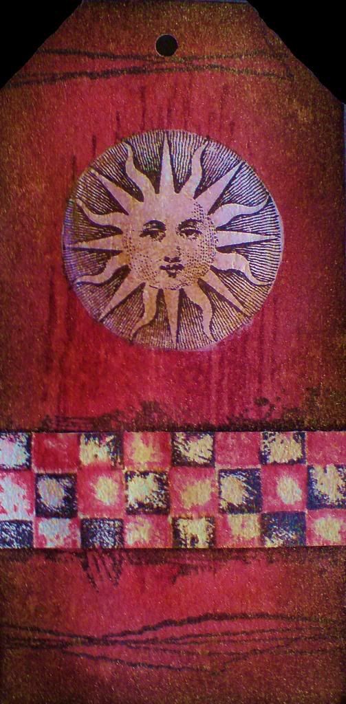
This first tag makes use of some stamps from Green Pepper Press that a friend got me for Christmas, and some stitch stamps from Autumn Leaves, neither of which I have had much of a play with. The tag was coloured with distress ink pads, then the sun was stamped using the painted mask technique I have mentioned in previous posts. I recently bought a bottle of gold Glimmer Mist spray, so spritzed the whole thing with that (to within an inch of it's life, to be honest!).

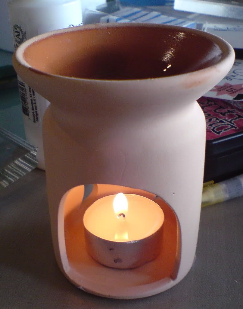
This next tag looks a bit washed out, but that's partly my poor photography I'm afraid! I'd always wanted to try a technique I once saw in a Tim Holtz video, where he melted beeswax in a melt pot and painted it onto his card project. I don't have a melt pot, but thought one of those oil burner thingies would do the job just right, and it did! Put the beeswax in the top, light the tealight, and Bob's your uncle! If you don't know what I'm talking about, I mean one of these:


I hope you like the tags! :o) Click on an image to enlarge it.
Saturday, 5 April 2008

Stamped Chipboard Flowers


These flowers are part of the new chipboard range by the Artistic Stamper. They're white on one side and grey on the other. The white sides were inked and stamped, and the grey sides were painted with acrylic dabbers and stamped.

I didn't spend too much time on them, because there is such a small amount of petal space available for stamping, that there was no point in doing anything too complicated, it just wouldn't be seen. The brown one is stamped and embossed in gold, which, as always, doesn't show up too well when scanned!

I hope you like them, click on an image to enlarge it. :o)
Friday, 4 April 2008

Tagstravaganza - Day 2

Another day, another tag!

Nothing fancy to say about this one that you haven't already read in yesterdays post, dear reader. Another of the Artistic Stamper's chipboard tags, decorated with their stamps and using the painted mask and batik techniques.

I hope you like it, click on any image to enlarge it :o)
Thursday, 3 April 2008

Tagstravaganza - Day 1 - The Painted Mask Technique


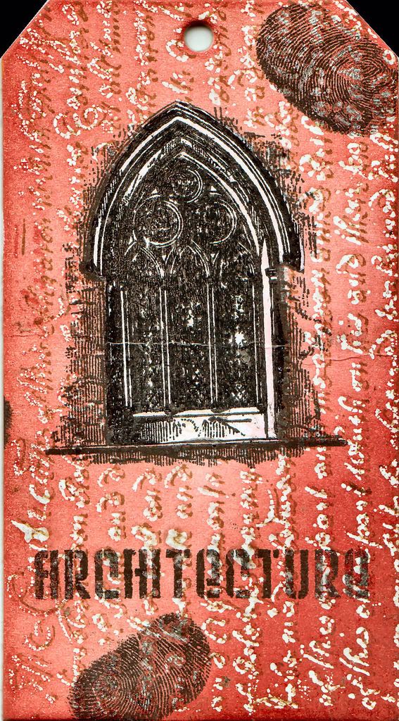
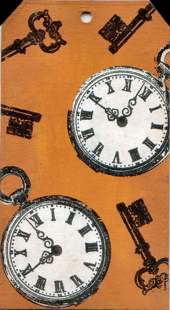
This is my first blog post in AGES so I'll dive straight in. I've been busy working with some of the new chipboard shapes from Artistic Stamper. On this large sized tag, I thought I'd have a go with a new technique I've dreamed up for colouring stamped images (at least it's new to me, if someone has claimed this before, I apologise!) I've called it the painted mask technique, and it's been used here on the pocket watches and the gothic arch. Basically it involved stamping your image, then painting it with acrylic paint (either white as I have done here, or in whatever colours suit your image). After painting, you stamp again in the same place, giving a masked effect but with coloured areas that match the stamp exactly (depending on how accurate you are with your stamp position).
The red side - text was stamped and embossed with clear powder. Tag then was coloured with fired brick and aged mahogany distress inks applied with cut'n'dry foam. Brown paper was placed over the tag and it was ironed with a hot dry iron to remove the embossing powder (Tim Holtz's batik technique). Text was stamped again with brushed corduroy distress ink. Arch was stamped with black versafine and dried with heat gun. It was then overpainted with white acrylic paint, dried and restamped. Finally the word Architecture was stamped with black versafine. I added two of natures "free" stamps (the most personal and individual of all!) and I was done.

Mustard side - painted with butterscotch acrylic dabber and edges distressed with brushed cordury pad (doesn't show up well in this scan). Watches and keys stamped with black versafine. Watch over-painted with white acrylic paint then restamped.

I hope you like them! Click on any image to enlarge it.

Saturday, 23 February 2008

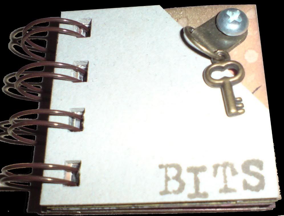
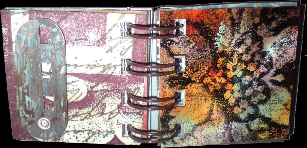
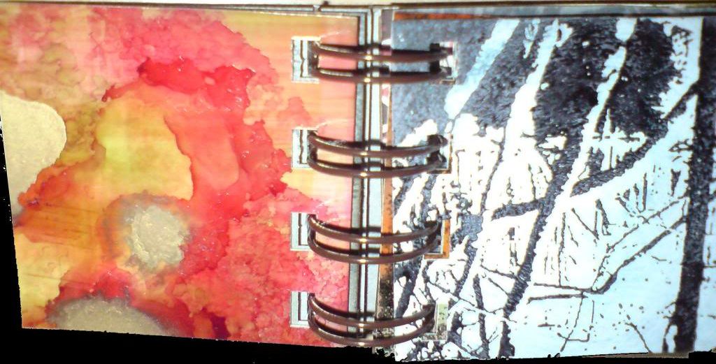
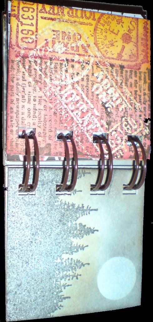
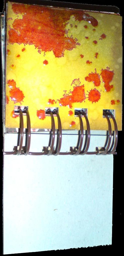
Bits Mini-book


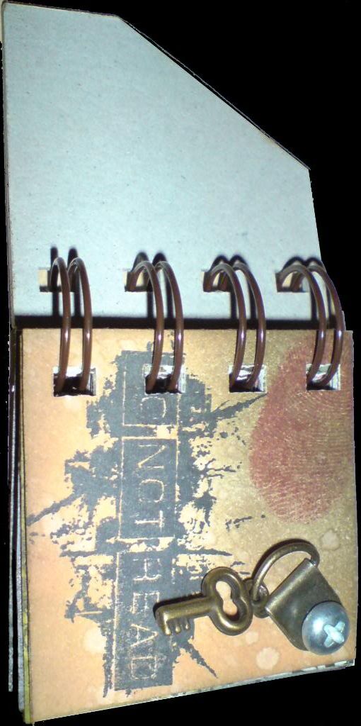
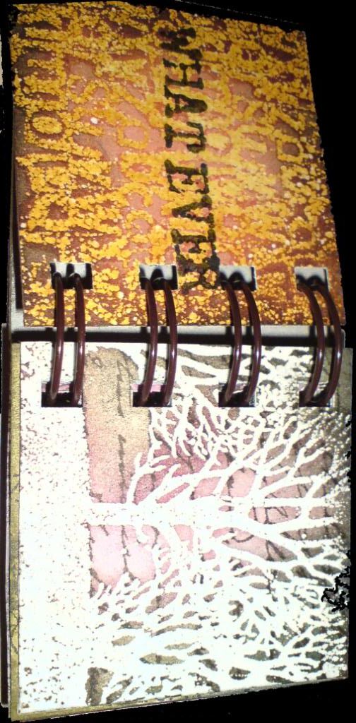
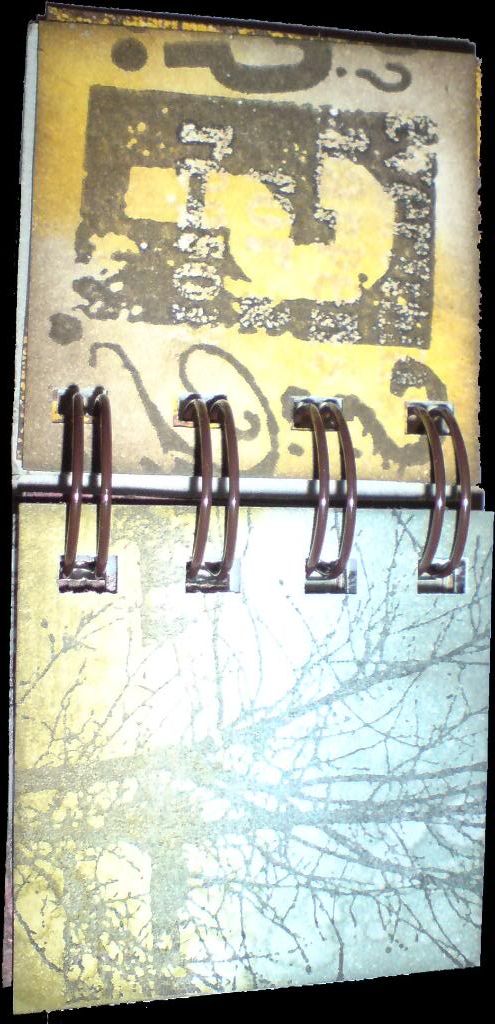
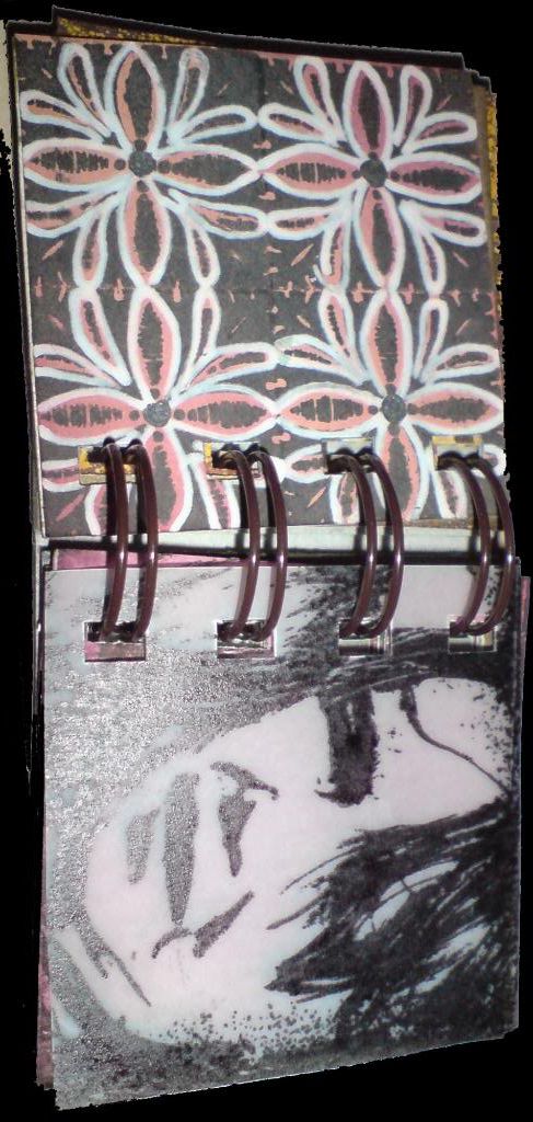
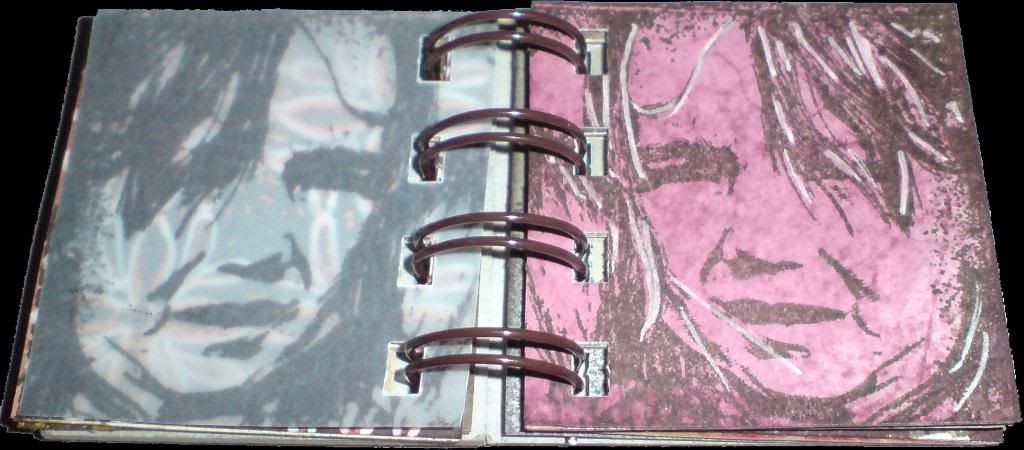
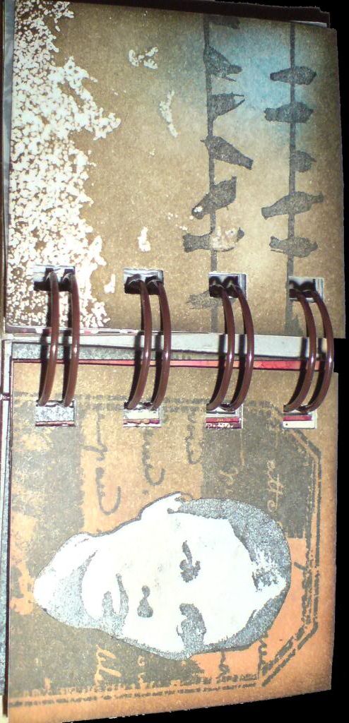
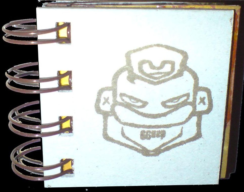
I've called this a mini-book, but perhaps it should really be called a micro-book, as it's only 2 inches square! It was intended as a kind of sampler, no set theme, just an attempt to incorporate a range of images and techniques on a small scale into one coherent whole.

As there are 18 sides plus covers in this, I'm not going to write about each one. Suffice it to say that the book incorporates stamping, masking, embossing, batik, dabbers and alcohol inks. That might sound a lot, but as the pages are so small, it didn't take to long to make. I hope you like it!

Click on any image to enlarge it.

Tuesday, 22 January 2008

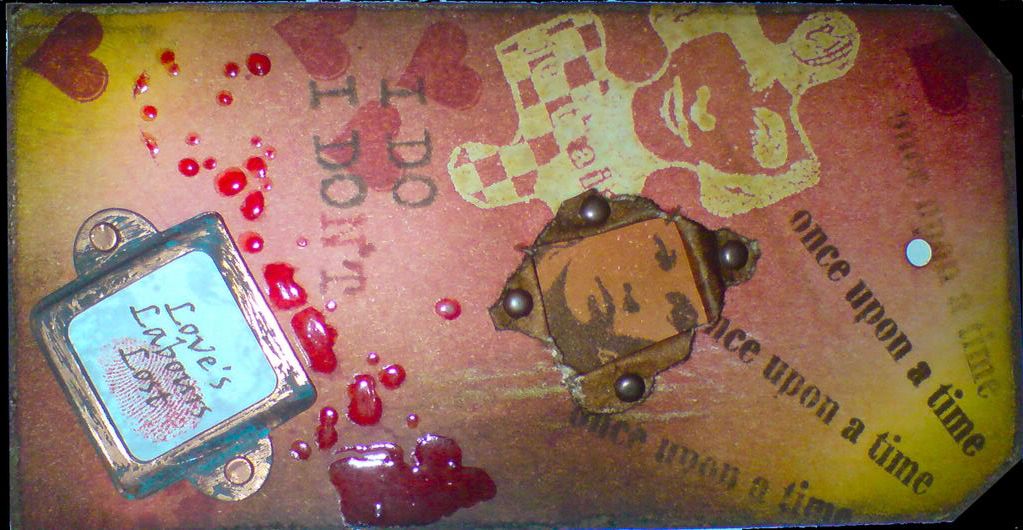
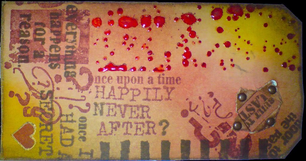
Once upon a tag...


front back

I don't often say this, though it's often true, and in this case it's more true than ever.... this looks a lot better in the flesh than when photographed!!

This tag started out as something very different. My plan was to make some tags using predominantly PaperArtsy stamps. Once I got under way, (and I don't know if this ever happens to you, dear reader), it quickly developed a mind/voice of it's own, and I just went with it! I did manage to largely confine it to PaperArtsy stamps, though I did use a few others when my limited PaperArtsy collection didn't yield up the right images.

The jigsaw piece was created using the Batik technique I explored in my last posting. The splatter stamps were highlighted with glossy accents and the copper bookplate was distressed with espresso and a greenish dabber (I forget the name of the colour). A portion of the back of each side was decorated so that when the tag was torn and the edges held back by brads, they wouldn't be white.

The heart on the back of the tag was outlined with a Sakura Gold-Touch pen. The words "Love's Labours Lost" were printed out in brown from the PC, and stamped with an image in clear embossing ink, which was then allowed to dry to give a watermark effect. The fingerprint is the artist's own :o)

I hope you like it. Click on any image to enlarge it.
Related Posts with Thumbnails