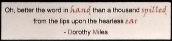
The theme for this week's Simon Says Stamp and Show Challenge is "hands" and I was immediately inspired to use a quote from a poem I've always loved. Most of you won't know this, but I studied British Sign Language for 17 years, eventually teaching in a college for Deaf people and also doing some sign interpreting, both in the UK and overseas. In the course of all this I made many Deaf friends, and one lady who made a big impression on me was Dorothy Miles, a Deaf poet and playright. Sadly she's no longer with us, but her work lives on, and the quote I've used is from her poem "To a Deaf Child". The quote reads:
"Oh, better the word in hand than a thousand spilled from the lips upon the hearless ear."
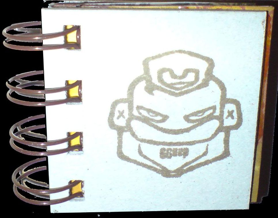
The arrangement of hands from Tim Holtz's Steampunk stamp set in the picture is almost (but not quite) an illustration of the sign for "talk", which I thought fitted with the quote nicely!
Our ever-generous sponsor Simon Says Stamp is offering a $50 gift voucher as the prize again this week! The winner will be chosen at random from those who enter the challenge, so why not give it a try? At the very least why not head over to the Challenge Blog to see how the other members of the design team have interpreted this weeks theme! :)
I found this image on my phone today, taken at the end of a holiday last year. I'd taken basic craft supplies with me as I knew the friend I was staying with would be at work a lot of the time. These were all the 6"x3" tags I'd made for a tag book during the trip. They've been seen on my blog individually before, but never all together like this. I thought it was a fun pic, with a different feel to it when they're all seen as a big group, so I thought I'd share it with you! :)
I've joined an online swap on the UKScrappers forum, where you make a tag 8"x4" and receive one back in return. I thought I'd have a try at it last night, because I've never worked at that size before and wanted to get a feel for it!
I used my new Santa stamp again (I'm sure I'll get bored with it eventually, lol) and created most of the embellishments myself. I painted a black bookplate gold and then distressed it with sandpaper and the nutcracker soldier has an acrylic fragment on it for a bit of gloss. The 25 numbers were cut on the Cricut, and the Believe word was created in Inkscape and printed onto card.
There are a few things I'm not satisfied with here, so I won't be sending it in to the swap, but I thought I'd share it anyway! Click on the image for a larger view.
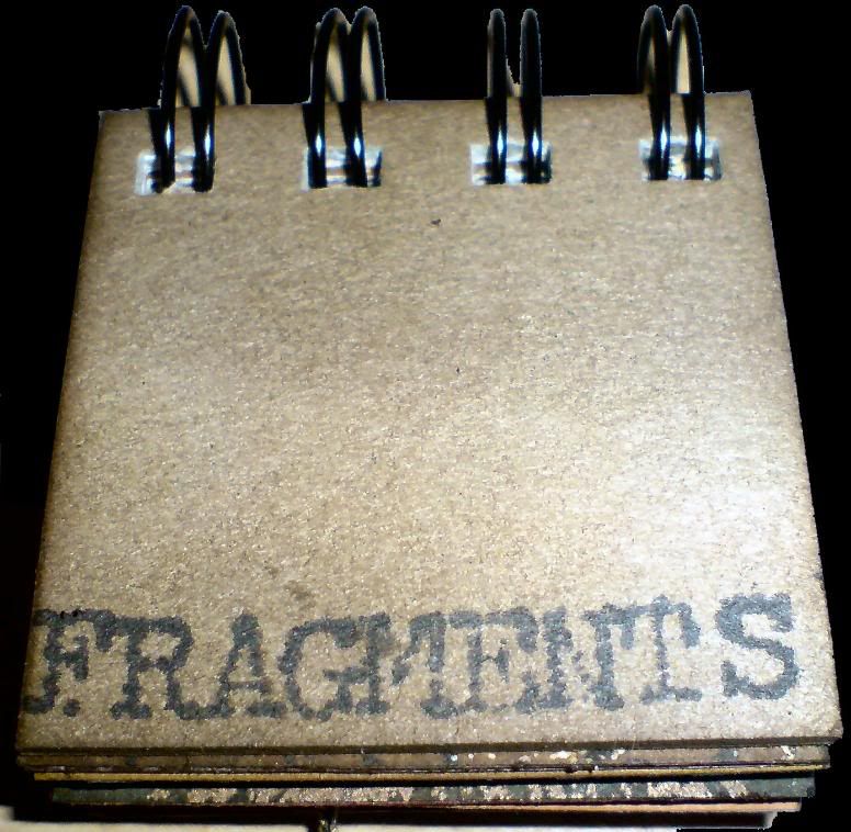
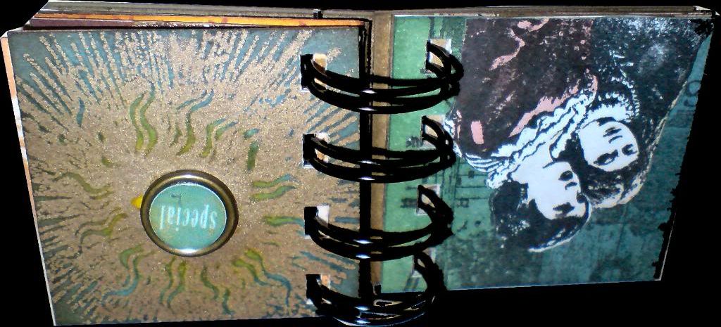
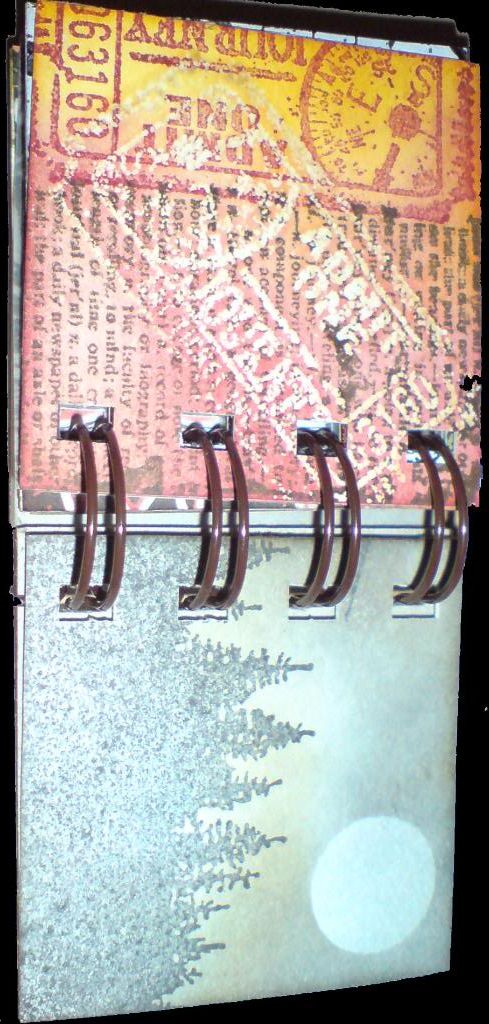
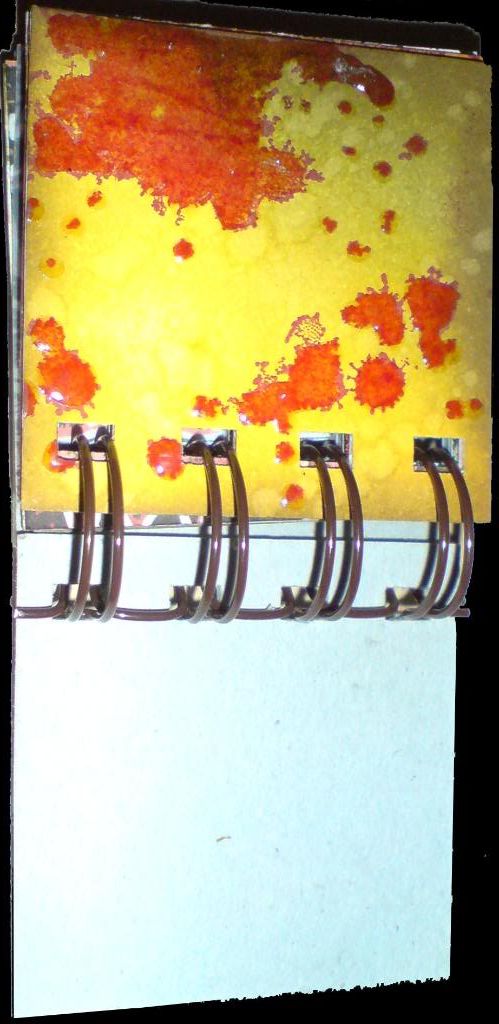
I'm getting quite hooked on these 2x2 books! They're a great size cos they're big enough to stamp on, but small enough that you can finish them quickly. This one is for a friends birthday, a few pages are duplicates of things in other projects, but I have mostly missed those out on the photos I've included on here. I hope you like it!
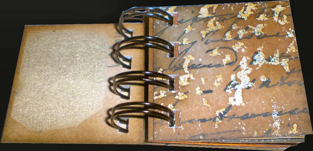
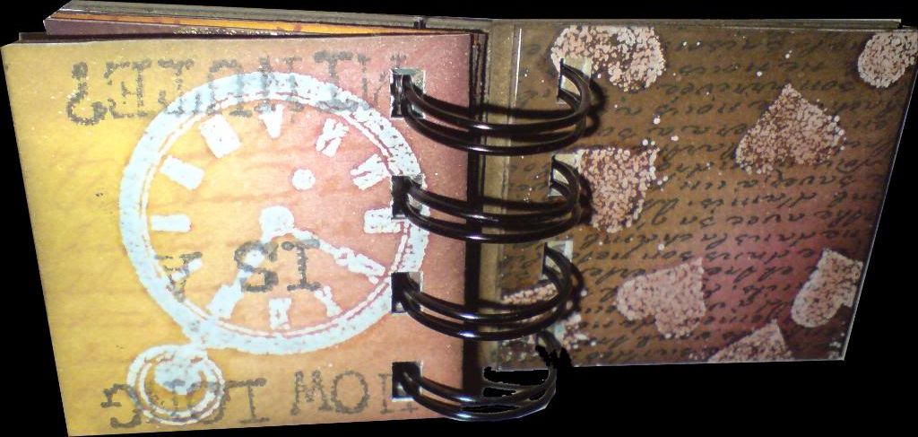
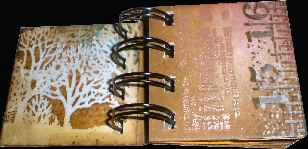
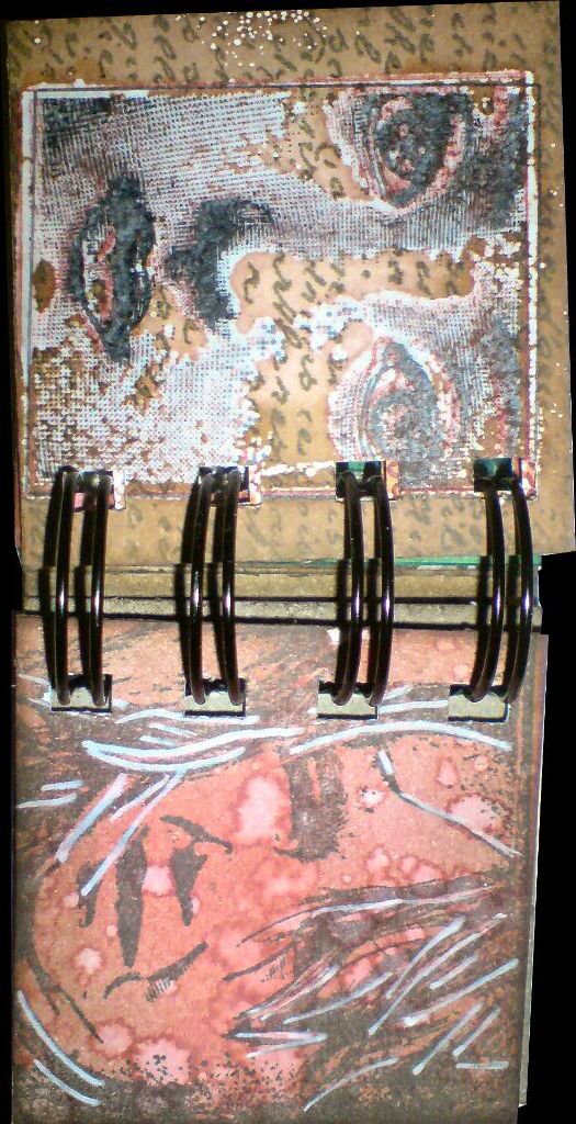
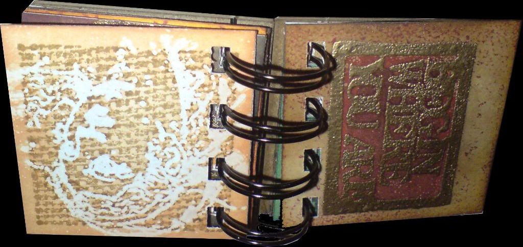
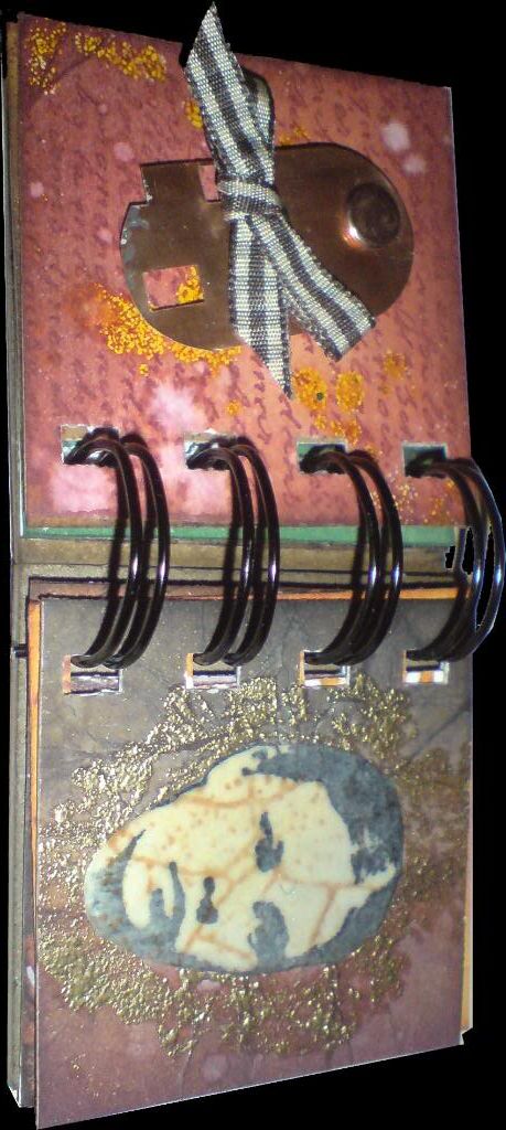
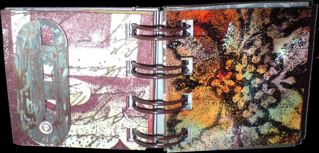
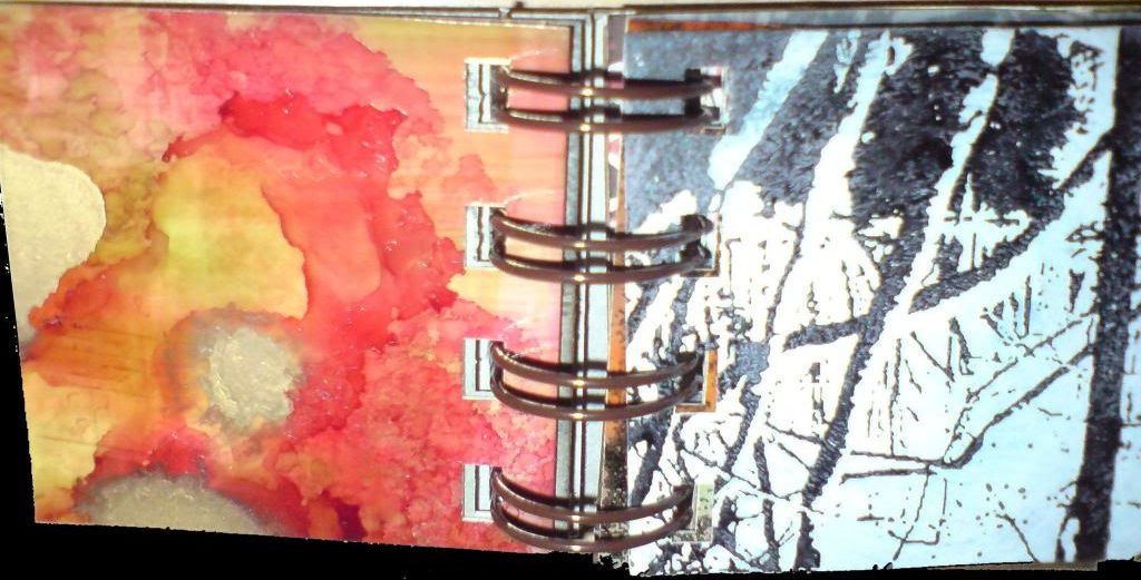
I've called this a mini-book, but perhaps it should really be called a micro-book, as it's only 2 inches square! It was intended as a kind of sampler, no set theme, just an attempt to incorporate a range of images and techniques on a small scale into one coherent whole.
As there are 18 sides plus covers in this, I'm not going to write about each one. Suffice it to say that the book incorporates stamping, masking, embossing, batik, dabbers and alcohol inks. That might sound a lot, but as the pages are so small, it didn't take to long to make. I hope you like it!
I don't often say this, though it's often true, and in this case it's more true than ever.... this looks a lot better in the flesh than when photographed!!
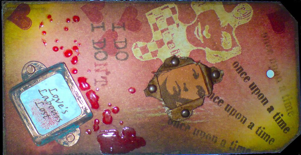
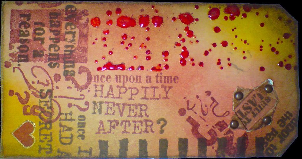
This tag started out as something very different. My plan was to make some tags using predominantly PaperArtsy stamps. Once I got under way, (and I don't know if this ever happens to you, dear reader), it quickly developed a mind/voice of it's own, and I just went with it! I did manage to largely confine it to PaperArtsy stamps, though I did use a few others when my limited PaperArtsy collection didn't yield up the right images.
The jigsaw piece was created using the Batik technique I explored in my last posting. The splatter stamps were highlighted with glossy accents and the copper bookplate was distressed with espresso and a greenish dabber (I forget the name of the colour). A portion of the back of each side was decorated so that when the tag was torn and the edges held back by brads, they wouldn't be white.
The heart on the back of the tag was outlined with a Sakura Gold-Touch pen. The words "Love's Labours Lost" were printed out in brown from the PC, and stamped with an image in clear embossing ink, which was then allowed to dry to give a watermark effect. The fingerprint is the artist's own :o)
I hope you like it. Click on any image to enlarge it.
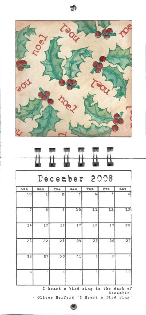
This is a fat page sized version of a tag I'd made a while back. Background is scattered straw distress ink applied with a baby wipe and edged with faded burlap. The holly was stamped in pine needles then painted with a water brush. The berries were painted with fired brick ink, which was also used to stamp the "noel" text. Finally a little glossy accents was applied to give the berries a bit of shine.
The quote reads "I heard a bird singing in the dark of December - Oliver Herford "I Heard a Bird Sing".
Thanks to everyone that's stuck with me and looked at each month as I've gone along. I hope you liked it. It was fun to make, though a lot of work!
As I said in my post yesterday, I felt the need to have a break from making Christmassy things for lists and swaps, and to make something just for myself.
The words in this tag book are taken from the song "They Shoot Horses, Don't They?" by Racing Cars. The song was inspired by the Jane Fonda movie of the same name (for all you trivia buffs out there! :o), and I've wanted to use it in a project for a while now. I took the opportunity to try out some of the stamps I've acquired recently and, of course, to use the Bind-it-all again.
While we're talking about tag books (we were, pay attention, there's a quiz later) I want your opinion on something. Although the pages in this book are made from stationery tags, and I've put eyelets in each one, I opted NOT to put ribbon through them. Anyone that knows me knows that I have so much ribbon it is almost coming out of my ears - I don't seem to be able to stop buying it. Much as I love ribbon, (to an extent that is, quite frankly, embarrassing for a middle-aged man), I've had a bit of a change of heart in the last few days.
Looking back at my projects and those of others online, I've been feeling lately that when I see tag books with ribbons sticking out the side from each page (as all MINE do) the book can sometimes look like it's suffering death by a thousand ribbons. Ribbon is lovely, but so much in one project perhaps seems a bit desperate and could almost be yelling "I'm pretty - love me, darn it, LOVE ME!!" Anyway, that's how I've been feeling lately. Rant over. I'd be interested in hearing your opinions! :o)
Click on the cover image below to see the "flipbook" version that allows you to turn the pages and to see the two-page spreads together, as they were intended to be viewed. If you're unable to view it, I have included a slide show below, so hopefully that will work for you!
Enjoy! :o)
P.S. If it doesn't work for you, your browser may not have the latest version of the bit it needs to see the book. You can get it by following this link:
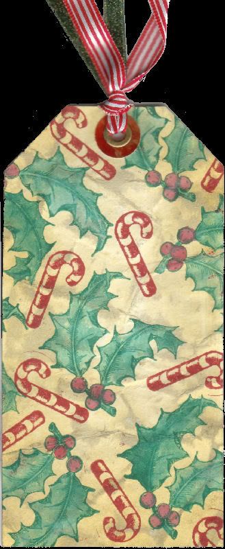
This is another 6x3 tag for the swap I'm involoved in. I started out making this as just the background for the tag, but I liked it so much, I left it just as it was!
Tag had a light coating of scattered straw distress ink, applied with a baby wipe. It was then crumpled, and an old paper ink pad rubbed across the raised areas. It was then spritzed with a little water and ironed flat.
Holly and candy cane stamps were applied with pine needles and fired brick distress pads, and coloured with a water brush. The ring around the eyelet is glossy card with alcohol inks applied to it. The holly berries had glossy accents applied to them for a bit of shiny. We like shiny. :o)
Click on the image to see a larger version. Thanks for taking a look! :o)
For quite some time now I've been dissatisfied with the way I've been displaying my work on this blog. Most of the things I make are books of one kind or another, and separating the pages and displaying them as individual images seems to me to take away a lot of their fundamental bookiness (I know that's not a real word, but as far as I'm concerned, it is now!). The main point of making a book and binding it is so that the person who looks at it does so by turning it's pages one after another, and that page-turning process is at the core of how we as readers interact with books.
So, I sat down at the computer (you all knew that I'm a rubber stamp geek, but did you know I'm a computer nerd too? lol), and MUCH tearing out of hair later (yes, yes, I didn't have any hair to begin with, I know. Still, it's a bit mean of you to point it out, shame on you!) I've created another version of my "I Know" book that I put up here in my previous post. It should (if it works correctly) allow you to "turn" the pages, and to zoom in and out of any page that you want to get a better view of.
This is how it works
This is the kind of view you will see while you browse through the book. Click your main mouse button on the bottom corner of any page, and holding it down, drag your mouse to turn the page. Letting go of the mouse button will release the page. You can do this to go forwards or backwards through the book. You can also click the other mouse button to zoom in or out.
I'd really value any feedback on this that you care to give! Should I display my past and future books like this too, rather than as regular images? There was quite a bit of effort involved in getting this to work, although now that I've done it, hopefully future examples can be made much quicker. All the same, if most of you don't like looking at the book this way, I'd prefer not to waste my time! LOL
P.S. If it doesn't work for you, your browser may not have the latest version of the bit it needs to see the book. You can get it by following this link:
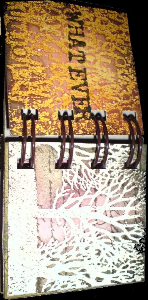
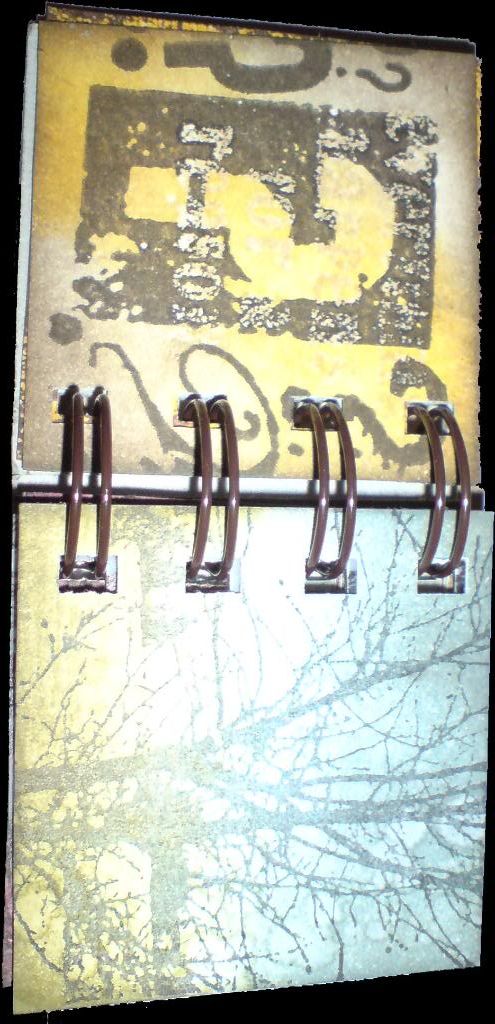
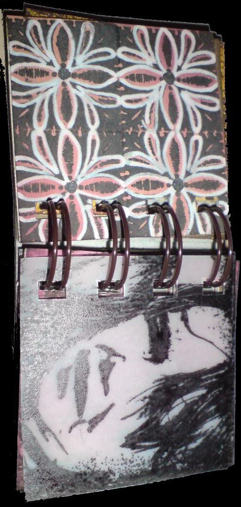
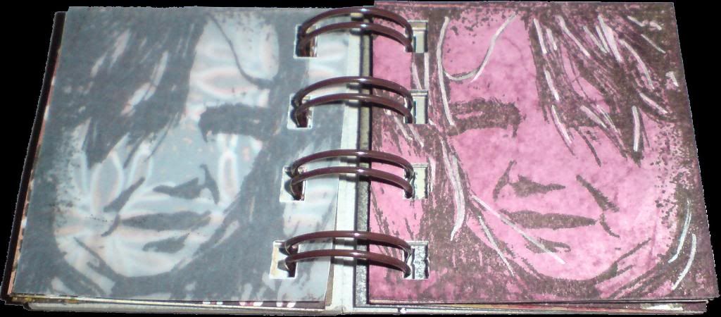
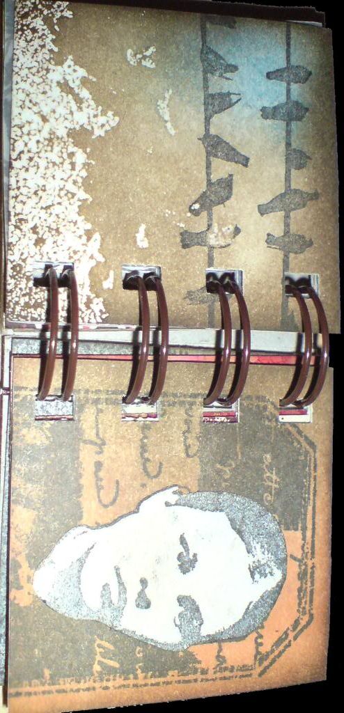
Challenged by a friend to make something using scrapbook papers (something I don't do often), this is what I came up with. The song I Know What You're Doing by Dionne Farris is a favourite on my ipod right now, and as I was listening to it when I started this, I used some of the lyrics as the text.
It's a Maya Road chipboard book, and was covered with Sage and Sky Butcher's Block papers. I've had those for a long time and always liked them, so it's nice to have finally used them on something. I also used some of the new Tim Holtz unmounted stamps, which I'm loving! While on holiday in the USA in the summer I bought some snaps that look like phillips screw heads, and I've used those for the first time here. Am loving those too!
This turned out a lot grungier than I had originally planned, I guess it was just the mood I was in! Oh, and just to say, if I'd actually counted and realised there were 20 sides of chipboard to be worked on, I may never have started it!! LOL
As ever, click on an image if you want to see a larger version. Enjoy :o)