Showing posts with label embossing powder. Show all posts

Monday, 6 February 2012

Torn, But Not Forgotten!


This weeks theme on the Simon Says Stamp and Show Challenge is to use a recipe of elements to feature in your project, which is consists of torn edges, distress inks, a button and wings.  As it had been quite some time since I had last made one, I decided to create an art doll for this week's challenge.

She is based around a cylinder of cardstock covered with Graphic 45 paper.  The skirt is the part that includes the torn edges and distress ink (I'm assuming you have already figured out where I used the buttons and wings! lol).

Our ever-generous sponsor Simon Says Stamp is offering a $50 gift voucher as the prize again this week! The winner will be chosen at random from those who enter the challenge, so why not give it a try? At the very least why not head over to the Challenge Blog to see how the other members of the design team have interpreted this weeks theme! :)

Monday, 10 October 2011

Wings Ain't What They Used to Be!

Don't you just hate it when the one-eyed flying cyclops hearts you've been keeping in an old bird cage finally chew their way out?  I know I do!  That's why, when I saw that this week's Simon Says Stamp and Show Challenge is "Things With Wings" I decided to work through my frustration by making a piece about it!  :)  I know lots of you out there have the same problem, so believe me when I say I feel your pain! lol

This actually took me quite a few days to make, simply because I'm the world's slowest cutter-out!  All of the detail in the wings seemed to take forever to do, but it was worth it in the end :)

Our ever-generous sponsor Simon Says Stamp is offering a $50 gift voucher as the prize again this week! The winner will be chosen at random from those who enter the challenge, so why not give it a try? At the very least why not head over to the Challenge Blog to see how the other members of the design team have interpreted this weeks theme! :)

Monday, 20 June 2011

Not-so-heavy Metal!

The theme for this week's Simon Says Stamp and Show Challenge is "some metal".  I've always been a lover of the faux batik technique, and having rediscovered it lately, I used it again on this card.

I stamped the main images and embossed them with clear powder and then applied distress inks to the card, adding further grunginess with water splatters.  Finally I ironed off the embossing powder and added the metal accent.

Our ever-generous sponsor Simon Says Stamp is offering a $50 gift voucher as the prize again this week! The winner will be chosen at random from those who enter the challenge, so why not give it a try? At the very least why not head over to the Challenge Blog to see how the other members of the design team have interpreted this weeks theme! :)

ETA - For Gabby (and any others who are interested) Tim Holtz demos this technique here.

Monday, 13 June 2011

Grungy Monday 11!

I am very pleased to let you know that I am one of the guest designers for this week's Grungy Monday Challenge! Hosted by Linda Ledbetter, this awesome weekly creative challenge celebrates the techniques of Tim Holtz and this week's technique is taken from January 2008, and can be found on Tim's blog here.

After you've read the technique on Tim's blog, I'm sure you'll have no trouble working out how I made this card.  The only thing that might not be so clear is how I made the dark brown lines that run through the panels.  Quite simply, I just folded a panel where I wanted a line, and rubbed the edge of the fold with an ink blending tool loaded with Walnut Stain distress ink, finally flattening the panel again. 

Please bear in mind that although I have listed the products I've used, there is absolutely no reason why you can't try this with the things you already have in your craft stash!

List of products used:
The other guest designer today is Deborah, please be sure to check out her always inspirational blog, her work is amazing! :)

By the way, if you love Tim's grungy style, you'll definitely love the All Things Tim yahoo group!  They even have a Grungy Monday file area where you can upload your work for the group to admire, and in turn, you can gain ideas and inspiration from the other group members.  Why not give it a look, it's free! (and awesome!)  :)

Monday, 13 December 2010

Christmas Tree Houses

Well, as you can see, I decided in the end not to put my Christmas village under my tree, but to hang them on a different tree!

Over on the Simon Says Stamp & Show Challenge blog today the new theme is "A Tim Holtz Technique". I decided to use the embossed resist technique. I cut the houses from white cardstock and coloured them with Barn Door and Pine Needles distress ink pads, after first stamping and embossing with clear embossing powder. All stamps were by Tim Holtz @ Stampers Anonymous. Even more amazing, I've actually taken a decent photo of the finished item! :) Click on the pic for a larger view!

Our ever-generous sponsor Simon Says Stamp is offering a $50 gift voucher as the prize again this week! The winner will be chosen at random from those who enter the challenge, so why not give it a try?


Tuesday, 20 April 2010

Stripey Flower Batik Card Thing

A simple looking card this one, but oddly enough, a lot going on technique-wise! :)

I started out by stamping the distressed lines with Versamark ink and embossing them with clear powder, to act as a resist. Then I applied distress inks (punctured tyre, shattered teapot and sprinkled corsage I think), and stamped the flowers in black. I then placed some kraft paper over the whole thing and ironed it to melt the embossing powder again, which soaked up into the paper. I then applied stripes of various promarkers over the top, to colour the white lined areas (mouldy peas, awkward silence, scraped knee and disappointed parent, if I remember rightly). Finally I overstamped the flowers with versamark and embossed with clear powder for a bit of shine. Oh, and I cut a white mat for it, colouring the edges with two overlapping shades of promarker (witchety grub and I-can't-believe-it's-not-butter).

As ever, click the pic for a larger view :)

Tuesday, 30 March 2010

A True Story

Inspired by some of the hangy things my friend Linda has been making, I decided to make something tonight that used more embellishments than is the norm for me. I used one of my shield designs from a little while ago, cut twice and layered to make it stronger.

Tim Holtz type charm, memo pin, Stampin' Up large eyelets, TH ball chain and a copper paper clip frame - not exactly overloaded, but more than I would usually use! :)

Background colours are Wild Honey and Barn Door Distress Inks, tree was stamped and embossed with a grainy white embossing powder before inking. Click on the image if you wish to see a larger view :)

Wednesday, 10 February 2010

Believe Tag 2: Armed and Dangerous

Well, not so much armed and dangerous as a sequel :) A long while back I posted a tag here that I'd made for a swap I was involved in (see it here).

At the time I said I wasn't very happy with it and would give it some more thought. I've only just realised that I forgot to post the final version, so I'm correcting that omission now! I almost (but not quite!) like the back better than the front, LOL Click on either image to see a larger version.


Front: The Santa stamp is one of Sir T!m's, the "BELIEVE" was printed from the computer. The bookplate was gilded and sanded. The "25" was cut on the Cricut and then inked and stamped. The baubles were cut with a circle punch, the hanging loops on them were cut on the Cricut. The toy soldier was cut from a piece of PP. The snowflakes in the background were stamped and embossed in white then the 2 shades of distress ink blue and black were applied with foam.

Back: Stamps by Elements (a Canadian company who were going to let me spend a day with them when I was in Vancouver, observing how stamps are made, but our diaries never matched up!). Coloured with Distress Ink pads applied with a water brush.

Wednesday, 14 October 2009

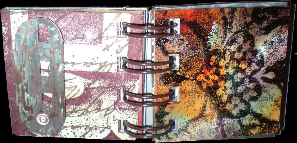
Snake Book Pages 1 & 2

I thought, dear reader, that we'd take a break from Halloween today, so here are two pages from a snake book I'm making, which will be bound with the Bind-it-All. They're not actually the first two pages of the book, but I've grouped them together here because the techniques used on both pages are the same. I only wanted 4 holes down each side of the page, so I didn't punch them on the BIA, I cut them on the Cricut instead, using the Sure Cuts a Lot software.

I used the faux batik technique on both pages. The large damask-type designs on the right-hand side of each page were stamped first onto the blank page using a Versamark ink pad and then embossed with clear embossing powder. Colour was then applied to each page using an ink blending tool, with the embossed areas acting as a resist so that colour didn't apply to those parts.

I then placed brown (kraft) paper over each page and ironed with a hot iron which melted the embossing powder until it soaked into the kraft paper and was removed from the page. Other parts of the page were then stamped and finally the main figures were stamped separately, coloured with Promarkers and cut out, then adhered to the page. I ran a pale grey marker around the edge of each figure to make it pop a little more.

2 down, 10 more pages to go! Click on the image for a larger view.

Monday, 17 November 2008

Video Tutorial - Santa Ornament Card!

I've had a few email requests asking questions about exactly how I made the card I posted here yesterday, so I've made a video tutorial for it. It's a bit rough and ready, 'cos I did it in a hurry, but hopefully you'll get the general idea!

What you need:

Distress Ink pads in Fired Brick, Broken China and Faded Jeans
Versamark ink pad
Black waterproof ink pad (Archival, Staz-on or Versafine)
Santa rubber stamp (I used the "A letter to Santa" set by Stampers Anonymous)
Paint-splatter stamp (or you could use a snowflakes stamp)
An ink blending tool and foam pads
An ornament-shaped or round card blank
Post-it notes
Scrap paper
Water brush (or regular artist's brush and water)
Green watercolour pens
Red Stickles glitter glue
White embossing powder
Heat tool
Non-stick craft mat
A dry artist's paintbrush

Monday, 27 October 2008

Ornament Cards

That time of year is coming around again, and my mind started turning towards Christmas cards. I'm sure that many of you are very organised and have already finished yours, but me, not so much! LOL

I took one of the ornament shapes that were on my blog a week or so ago and welded two together to make a card blank. I've decorated a few by stamping and embossing in white, then inking over the top. I hope you like them!

Saturday, 5 April 2008

Stamped Chipboard Flowers


These flowers are part of the new chipboard range by the Artistic Stamper. They're white on one side and grey on the other. The white sides were inked and stamped, and the grey sides were painted with acrylic dabbers and stamped.

I didn't spend too much time on them, because there is such a small amount of petal space available for stamping, that there was no point in doing anything too complicated, it just wouldn't be seen. The brown one is stamped and embossed in gold, which, as always, doesn't show up too well when scanned!

I hope you like them, click on an image to enlarge it. :o)

Friday, 4 April 2008

Tagstravaganza - Day 2

Another day, another tag!

Nothing fancy to say about this one that you haven't already read in yesterdays post, dear reader. Another of the Artistic Stamper's chipboard tags, decorated with their stamps and using the painted mask and batik techniques.

I hope you like it, click on any image to enlarge it :o)

Thursday, 3 April 2008

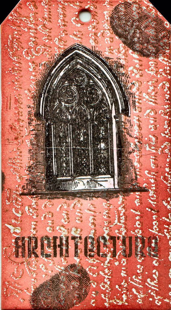
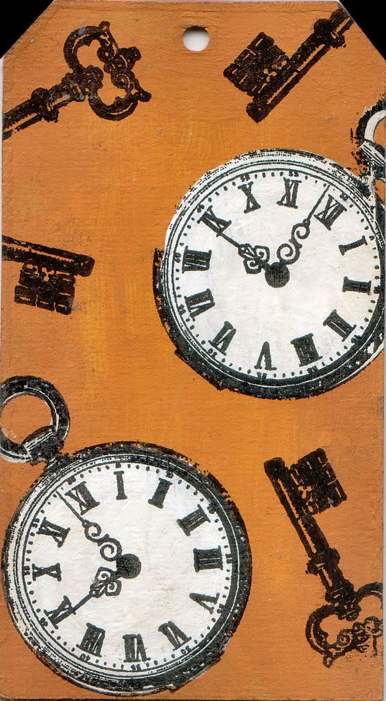
Tagstravaganza - Day 1 - The Painted Mask Technique


This is my first blog post in AGES so I'll dive straight in. I've been busy working with some of the new chipboard shapes from Artistic Stamper. On this large sized tag, I thought I'd have a go with a new technique I've dreamed up for colouring stamped images (at least it's new to me, if someone has claimed this before, I apologise!) I've called it the painted mask technique, and it's been used here on the pocket watches and the gothic arch. Basically it involved stamping your image, then painting it with acrylic paint (either white as I have done here, or in whatever colours suit your image). After painting, you stamp again in the same place, giving a masked effect but with coloured areas that match the stamp exactly (depending on how accurate you are with your stamp position).

The red side - text was stamped and embossed with clear powder. Tag then was coloured with fired brick and aged mahogany distress inks applied with cut'n'dry foam. Brown paper was placed over the tag and it was ironed with a hot dry iron to remove the embossing powder (Tim Holtz's batik technique). Text was stamped again with brushed corduroy distress ink. Arch was stamped with black versafine and dried with heat gun. It was then overpainted with white acrylic paint, dried and restamped. Finally the word Architecture was stamped with black versafine. I added two of natures "free" stamps (the most personal and individual of all!) and I was done.

Mustard side - painted with butterscotch acrylic dabber and edges distressed with brushed cordury pad (doesn't show up well in this scan). Watches and keys stamped with black versafine. Watch over-painted with white acrylic paint then restamped.

I hope you like them! Click on any image to enlarge it.

Thursday, 28 February 2008

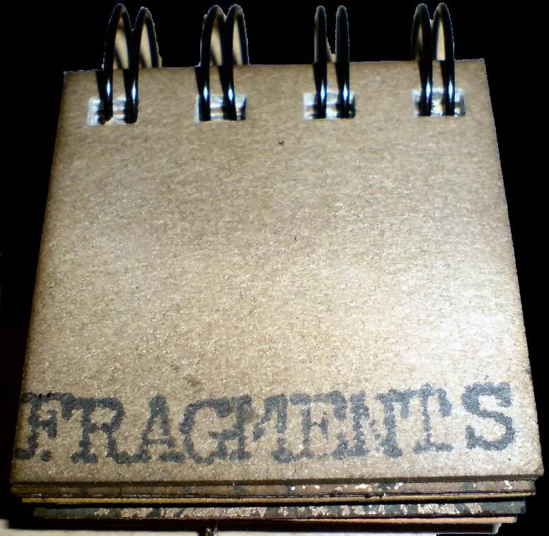
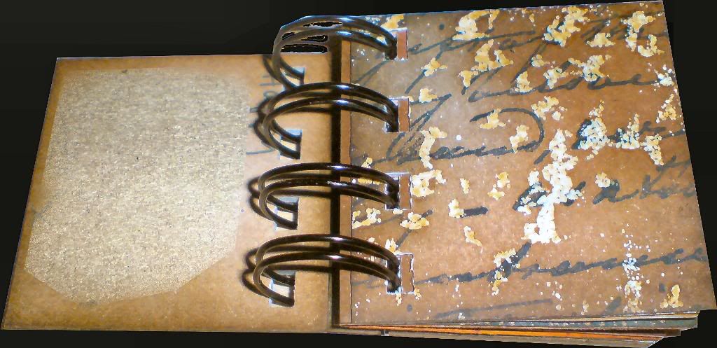
Fragments Mini-book


I'm getting quite hooked on these 2x2 books! They're a great size cos they're big enough to stamp on, but small enough that you can finish them quickly. This one is for a friends birthday, a few pages are duplicates of things in other projects, but I have mostly missed those out on the photos I've included on here. I hope you like it!

Click on any image to enlarge it.

Saturday, 23 February 2008

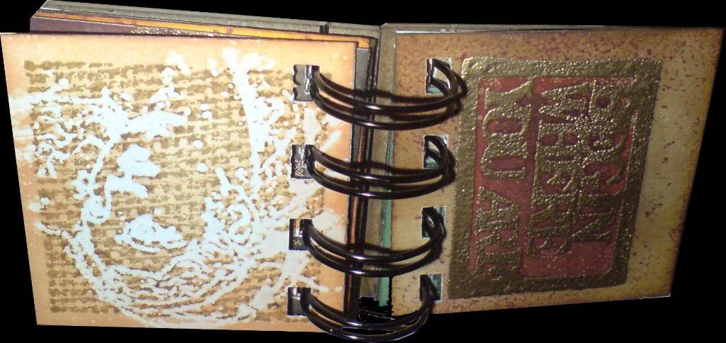
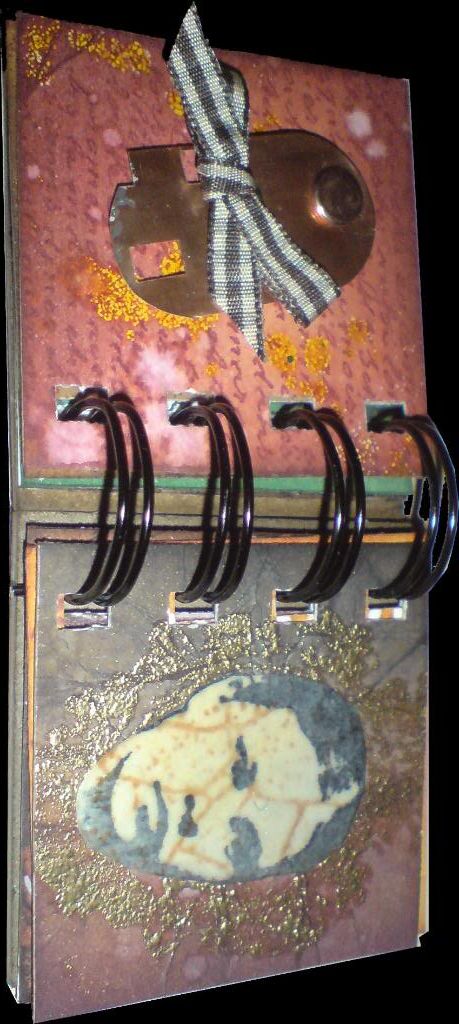
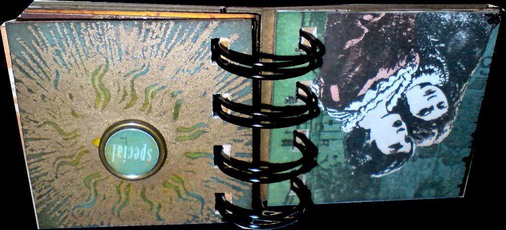
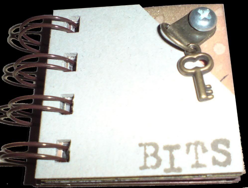
Bits Mini-book


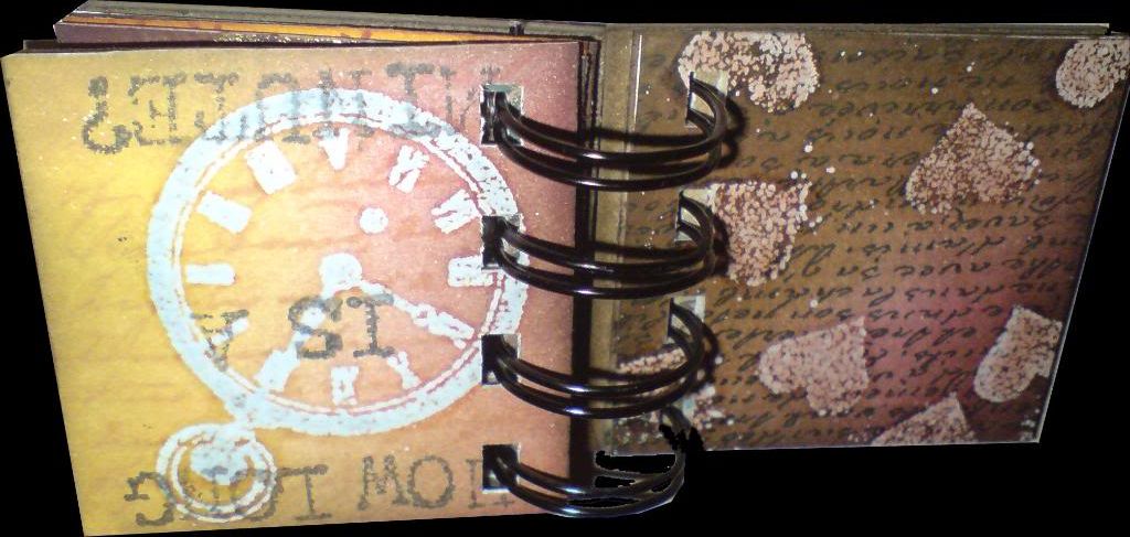
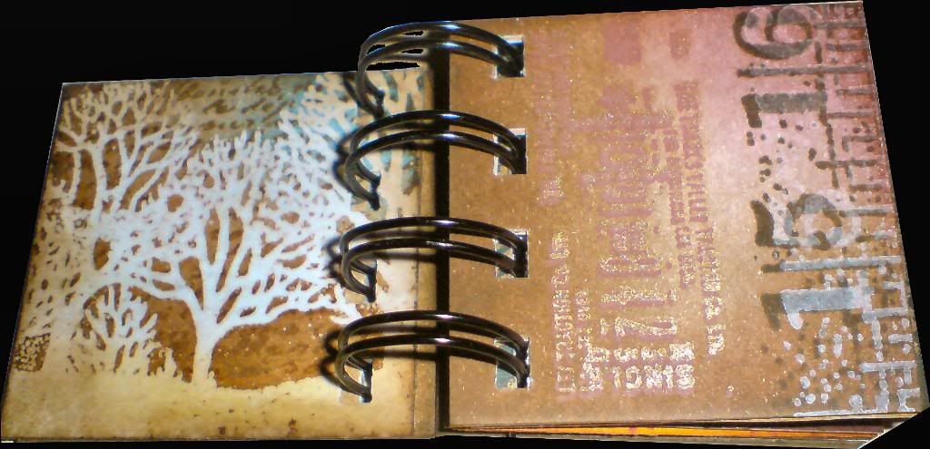
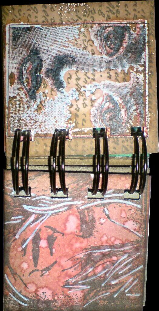
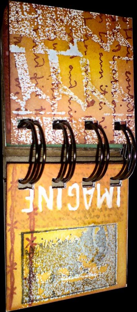
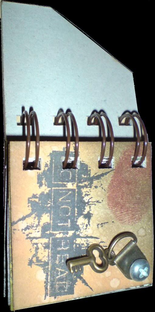
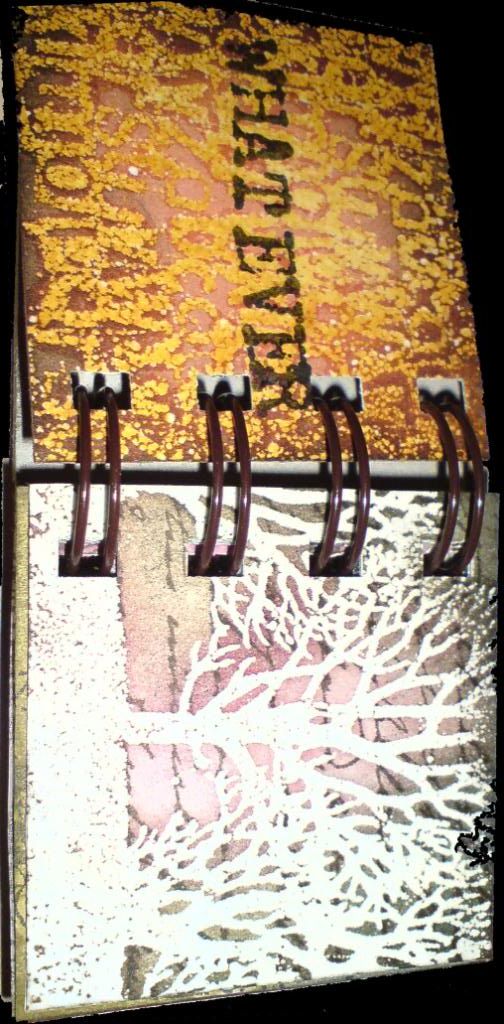
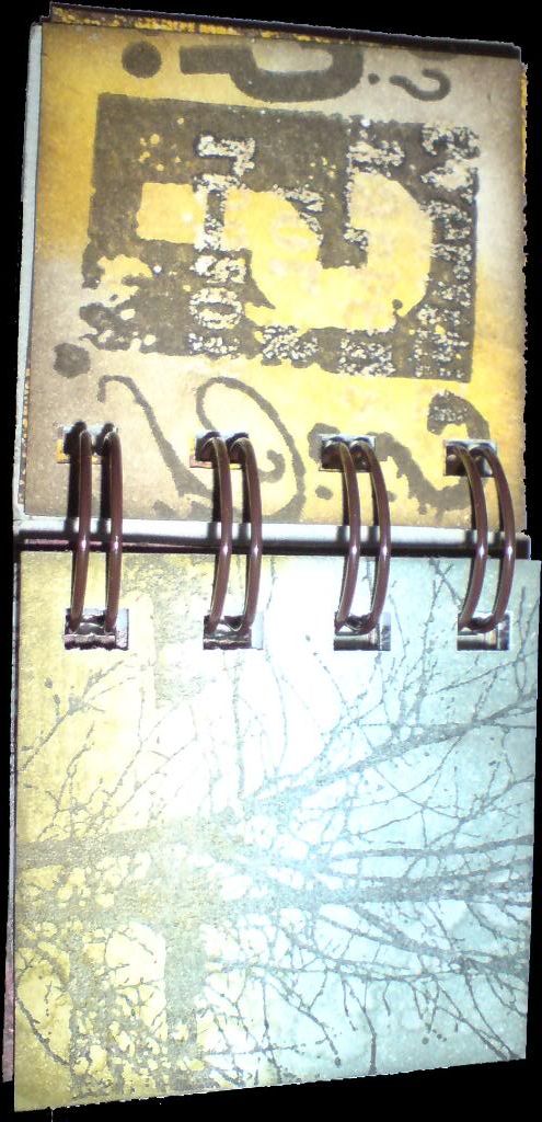
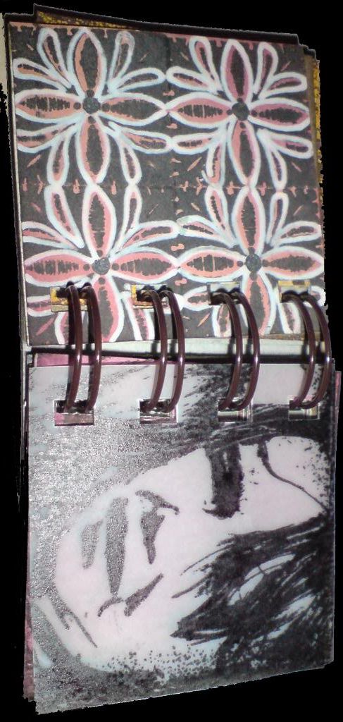
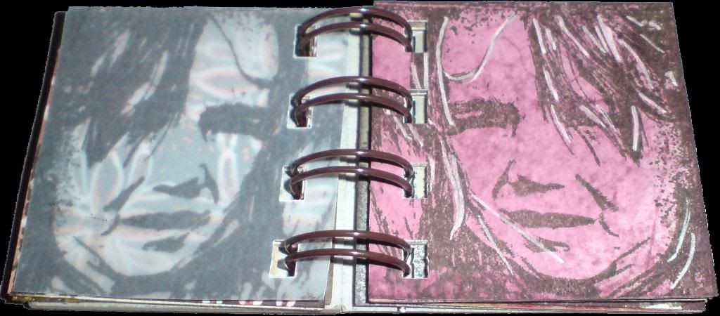
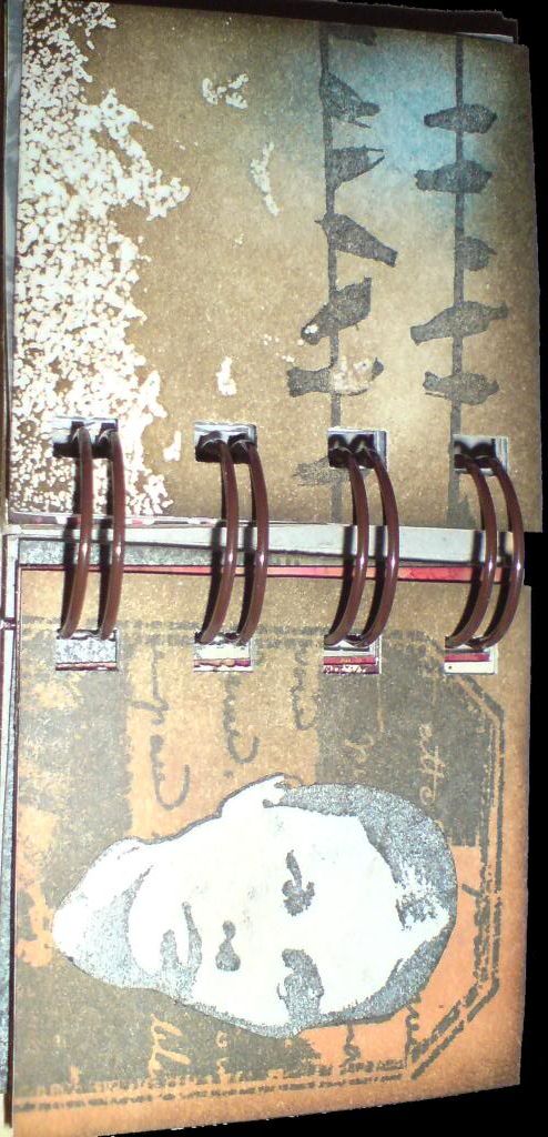
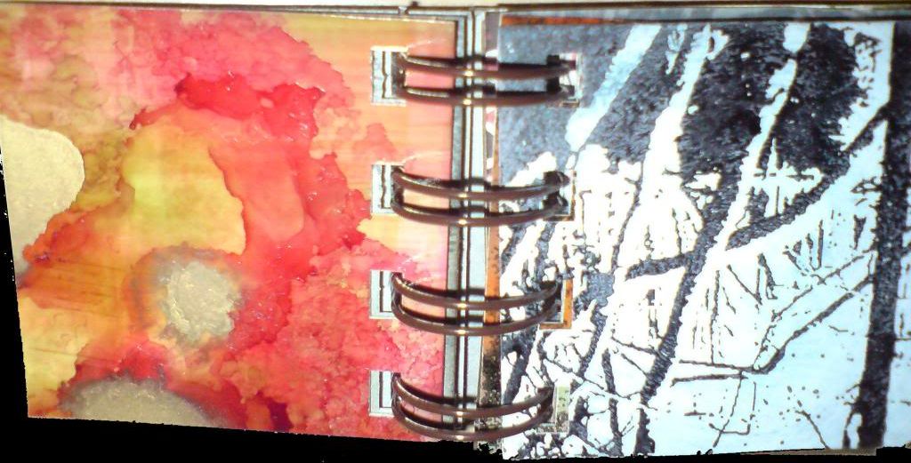
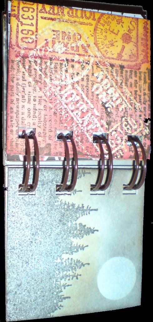
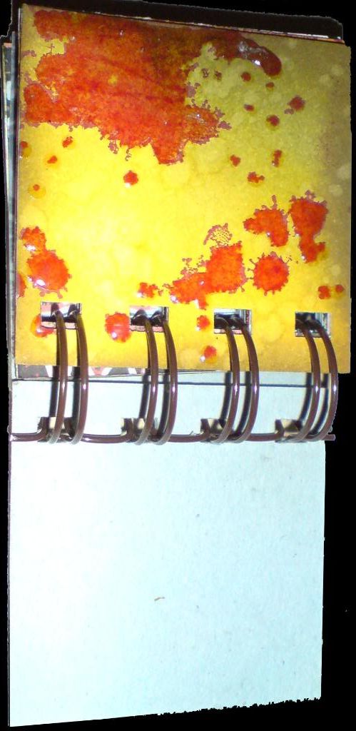
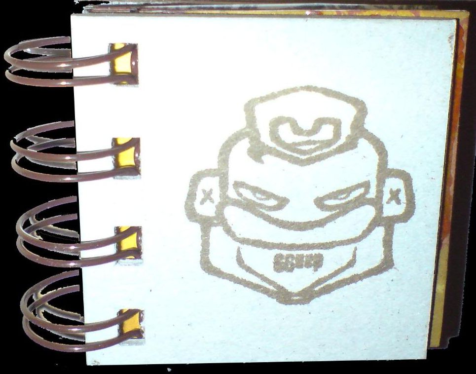
I've called this a mini-book, but perhaps it should really be called a micro-book, as it's only 2 inches square! It was intended as a kind of sampler, no set theme, just an attempt to incorporate a range of images and techniques on a small scale into one coherent whole.

As there are 18 sides plus covers in this, I'm not going to write about each one. Suffice it to say that the book incorporates stamping, masking, embossing, batik, dabbers and alcohol inks. That might sound a lot, but as the pages are so small, it didn't take to long to make. I hope you like it!

Click on any image to enlarge it.

Tuesday, 22 January 2008

Once upon a tag...


front back

I don't often say this, though it's often true, and in this case it's more true than ever.... this looks a lot better in the flesh than when photographed!!

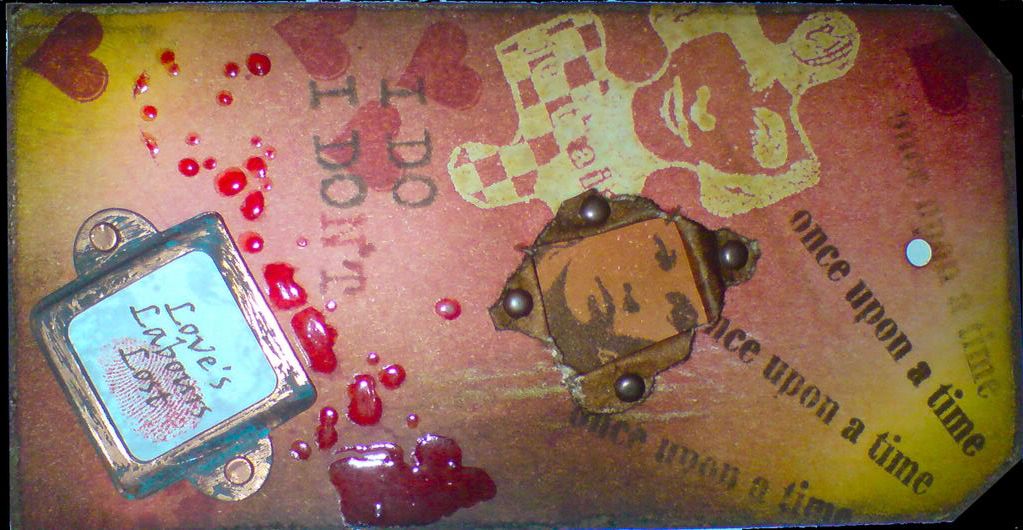
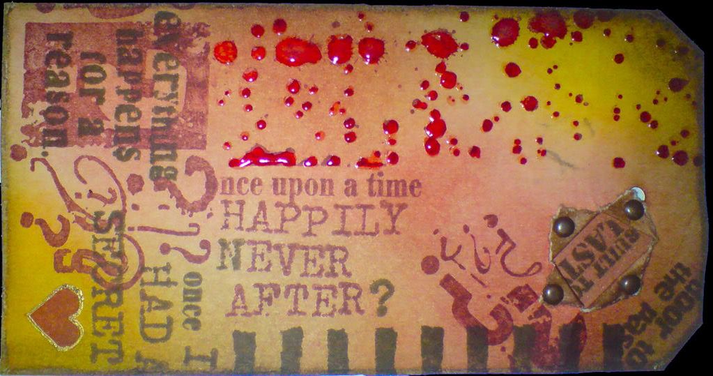
This tag started out as something very different. My plan was to make some tags using predominantly PaperArtsy stamps. Once I got under way, (and I don't know if this ever happens to you, dear reader), it quickly developed a mind/voice of it's own, and I just went with it! I did manage to largely confine it to PaperArtsy stamps, though I did use a few others when my limited PaperArtsy collection didn't yield up the right images.

The jigsaw piece was created using the Batik technique I explored in my last posting. The splatter stamps were highlighted with glossy accents and the copper bookplate was distressed with espresso and a greenish dabber (I forget the name of the colour). A portion of the back of each side was decorated so that when the tag was torn and the edges held back by brads, they wouldn't be white.

The heart on the back of the tag was outlined with a Sakura Gold-Touch pen. The words "Love's Labours Lost" were printed out in brown from the PC, and stamped with an image in clear embossing ink, which was then allowed to dry to give a watermark effect. The fingerprint is the artist's own :o)

I hope you like it. Click on any image to enlarge it.

Sunday, 20 January 2008

Batik Style Tags

These 3 tags use the batik tag technique explained by Tim Holtz on his blog. I used a selection of his stamps, my bird stamps and a couple of others from other sources.

Basically, each tag is stamped in a pale distress ink colour and then clear embossed. Using cut'n'dry foam, the tag is inked with darker distress inks, with the embossing acting as a resist.

Brown paper or newsprint is then placed over the embossing, and it is ironed with a hot iron until the embossing powder melts again and is soaked into the brown paper.

Finally, other images were stamped onto the tag, the edges were distressed by filing them and then applying walnut distress ink.

I hope you like them! Click on any image to enlarge it.

Tuesday, 8 January 2008

Crackle Frame Shadow Box


I thought I'd try something a bit different today - a shadow box. I bought a few of these frames a while back and have been waiting for an excuse to have a go at one! All stamps used in this project were from the Artistic Stamper, as were the watch parts.

The inside of the frame was painted with espresso paint dabber, and the front and outer edges with frayed burlap crackle paint. When the crackle paint had dried, I applied walnut stain distress ink to it to accentuate the cracks in it. The "Time is..." phrase was stamped with black Staz-on. The crackles don't show up that well in this photo, but they're there, believe me!

The background card inside the frame was tinted with walnut stain distress ink applied with Cut'n'Dry foam and then flicked with water to produce lighter spots on it. I then crumpled it up, flattened it slightly, then rubbed it lightly more walnut ink to highlight the crumple folds. I then turned it over, spritzed it with a little water and ironed it flat (yes, yes... I know.... enough already! Those of you that know me find it hard to imagine me with an iron in my hand, but you have to believe me, it's true! Would I lie to you, dear reader?) For some reason that I have not yet fathomed, this produced light blue/grey marks where the crumples had been. I'm not complaining, I think it looks great, I just wish I knew how it had happened!

The card was then stamped with a calligraphic mat and tape measure stamp in brushed corduroy distress ink, and glued into the frame.

The watches were created as follows (going from right to left):
  • stamped in walnut stain distress ink
  • stamped and embossed with gold embossing powder then tinted with walnut ink
  • stamped with black Staz-on onto acetate, run through a Xyron sticker-maker to make the back sticky, then gold leaf was applied to the back. It was then scrubbed with a rough brush to distress it slightly.
The watches were layered with 3d foam pads.

The watch face and glass were layered in the lower left corner with a spiral paper clip, tinted with gold Krylon pen.

The key in the top right corner was a real one I had lying around the house, which was suspended from jute twine and held in place with 2 drawing pins coloured with a copper Krylon pen.

The chipboard key was from Maya Rd. It was coloured with gold Krylon, sanded to distress the edges and gently edged with walnut distress ink. It doesn't show up well in this photo, but the word ORIGINAL was then stamped onto the key using black Staz-on ink.

And that's about it! It took a fair while to make, but I'm really pleased with it. I hope you like it too! :o)

Thursday, 20 December 2007

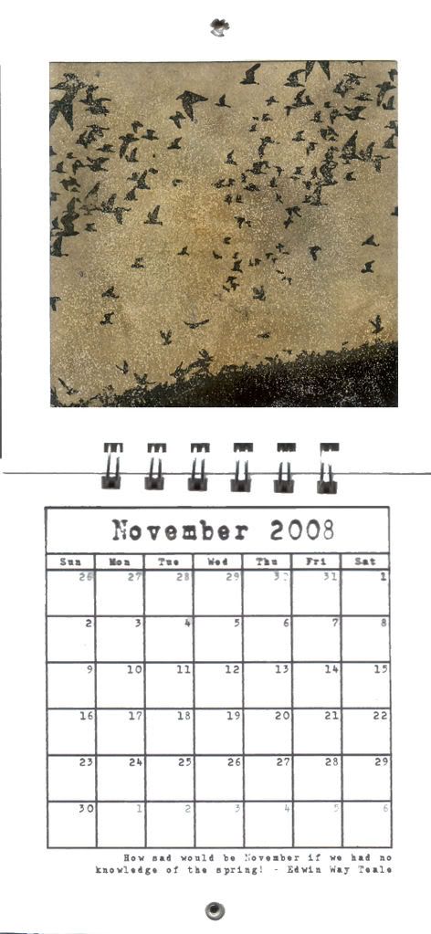
Bind-it-all Calendar - November

November, and a page made with my own stamps that I had made. The birds in flight are one stamp (stamped 1/2 off the page on the left and right sides) and the birds on the ground are another stamp.
The background was created using Tim Holtz's embossing powder/flicking technique from the Christmas tags series on his blog. There's not much else to say about this one, except that I think the stamps have given a really clear impression, and I'm pleased with them! :)

Quote reads "How sad would be November if we had no knowledge of the spring! - Edwin Way Teale"

December tomorrow!
Related Posts with Thumbnails