Wednesday, 29 June 2011

The spooky heart card

I'm not long back from a few days spent staying with my friend Hels.  Apart from enjoying her wonderful hospitality, it was fun to do a bit of crafting using someone else's stamp collection for a change!  This card is one of the things I made while I was there.

The background is a piece from the "paint palette" page in Tim Holtz's Crowded Attic card stack.  I used my finger to rub white acrylic paint on it, making it thicker on the left edge and thinner as I moved right, until the paint stopped around 2/3 of the way across.  I then applied Fired Brick distress ink around the edges.

The central heart was stamped and masked, then the other two hearts were stamped.  All 3 were coloured with a red promarker and I dripped alcohol ink blending solution onto the central heart to make it's colour bleed out.  I masked off the area around the heart and stamped the image onto it.  The phrenology head was coloured yellow (somehow - I forget what I did, lol) and then Fired Brick was sponged onto it.  The eyes were highlighted with a white pen.  Elements were edged with a warm grey promarker and the mat was coloured with the same pen.  That's about it!  I didn't realise it was so complicated until I sat down to type this, lol!

Monday, 27 June 2011

A dream in blue

The theme for this week's Simon Says Stamp and Show Challenge is "a word".  I decided to limit this piece so that it only featured colour as part of the background.

The dream was stamped first, and embossed with clear powder.  I tapped the card very firmly before heating the powder, so that the resist technique would be patchy.  After colouring the background using Claudine Hellmuth paints applied with a baby wipe, I re-stamped the "dream" using black Archival ink, using a cut'n'dry nib to remove most of the black ink from the letters to give a more distressed effect.  The other images were stamped separately and then fixed in place.

Our ever-generous sponsor Simon Says Stamp is offering a $50 gift voucher as the prize again this week! The winner will be chosen at random from those who enter the challenge, so why not give it a try? At the very least why not head over to the Challenge Blog to see how the other members of the design team have interpreted this weeks theme! :)

Wednesday, 22 June 2011

That bluey whiteness you can only get with Daz!

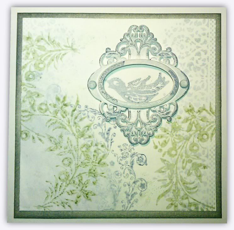
Another card where I've limited myself as to what I could use on it - in this case just white paint and 2 distress ink pads, weathered wood and bundled sage.  It took 3 coats of white acrylic to cover the metal embellishment, but I like how it turned out! :)  The photo is a bit dodgy, the mat around the edge is coloured with weathered wood, which is a pale blue, but it looks green in this photo!  Ah well, can't win em all! lol

Tuesday, 21 June 2011

How cool is this?!?!?

Most of you won't know this, but I was in Los Angeles for the last 3 weeks, visiting some friends for a bit of a holiday.  I had a great time (thank you for asking!), and as I left for the airport my friends gave me a parting gift.  My jaw just about hit the floor when I saw what it was - a crafting apron with my avatar professionally embroidered on it!!!  Isn't it fantastic! 

I've included a pic of me wearing the apron so you can get an idea of the size of the embroidery.  (If you look at my face in the pic and compare it to the embroidery, I think you'll agree the resemblance is uncanny!  lol)  I can't get over how thoughtful they were to have this made!  AND how sneaky they were!  :)

Back tomorrow! :)

Monday, 20 June 2011

Not-so-heavy Metal!

The theme for this week's Simon Says Stamp and Show Challenge is "some metal".  I've always been a lover of the faux batik technique, and having rediscovered it lately, I used it again on this card.

I stamped the main images and embossed them with clear powder and then applied distress inks to the card, adding further grunginess with water splatters.  Finally I ironed off the embossing powder and added the metal accent.

Our ever-generous sponsor Simon Says Stamp is offering a $50 gift voucher as the prize again this week! The winner will be chosen at random from those who enter the challenge, so why not give it a try? At the very least why not head over to the Challenge Blog to see how the other members of the design team have interpreted this weeks theme! :)

ETA - For Gabby (and any others who are interested) Tim Holtz demos this technique here.

Saturday, 18 June 2011

Card in a Hurry!

I needed a card for a friend the other day and didn't have a ready-made one to hand so I put this one together in just a few minutes!  I used squares from the Retro Grunge card stack for the panels and mats and the large mat was white card coloured with Walnut Distress Stain.  Not a masterpiece by any means, but it did the job! :)

More tomorrow! :)

Friday, 17 June 2011

All good things must come to an end

This is the last of the cards I made for the card swap.  A bit of paper tape, a bit of Tattered Time, a bit of stamping, a bit of distress stain and a bit of white paint and before you know it, you've got a card! :)

Something else tomorrow :)

Thursday, 16 June 2011

Tattered Time Card

Here's another of the cards from the card swap I was in.  The background of the main panel is taken from DCWV's "Tattered Time" card stack.  If you like steampunk-y things, I can thoroughly recommend it!  The corners are more of the paper tape I bought recently and colouring was courtesy of Distress Stains.

More tomorrow!

Wednesday, 15 June 2011

10 minute David

Another card swap card today, and I couldn't make a collection of cards without including at least one with one of my favourite stamps!  The great thing about this card is that it only took literally 10 minutes!

I think the stamp is bold enough that you can play a bit fast and loose with the colouring of it, so I coloured this card with distress stains, just drawing with them on the card as if they were pens, not being worried if they strayed over the lines, which they were always going to do because the applicator tips are at least a half inch wide.  I'm really happy with the rough-and-ready appearance of the colour and feel that it works well with this image :)  In a way it's a bit like an oil painting - if you look closely, you can see where the colours have gone over the lines, but when you step back and look at the card as a whole, it totally works!

More tomorrow!  :)

Tuesday, 14 June 2011

The Pea and Ham Soup Card!


That green panel on the left side is really making me hungry for pea and ham soup! :)  I love the chalkboard style of the numbers on the black paper tape I used as a border for this card.  It's the only card I've made with that particular tape so far, but I predict more in the future! :)

More tomorrow :)
Related Posts with Thumbnails