Monday, 8 August 2011

A Panel Show

The theme for this week's Simon Says Stamp and Show Challenge is "a Tim Holtz technique", and I had to think about this one for a while, just because there are so many techniques to choose from!

In the end I went for the Wrinkle-free Distress technique.  If you're not familiar with it, Tim has posted a video on youtube demonstrating it.  It's the 2nd technique in the video.

Our ever-generous sponsor Simon Says Stamp is offering a $50 gift voucher as the prize again this week! The winner will be chosen at random from those who enter the challenge, so why not give it a try? At the very least why not head over to the Challenge Blog to see how the other members of the design team have interpreted this weeks theme! :)

Monday, 1 August 2011

A Night at the Movies!

The theme for this week's Simon Says Stamp and Show Challenge is "a tag", and I had so much fun making this vintage movie-themed tag!

The green part was white card embossed in one of the Tim Holtz embossing folders from the "Playing Games" set.  I then sprayed with green and blue colorwash sprays, which I diluted with water and applied with a mini mister.  I then took a Wild Honey distress ink pad and applied it directly to the ticket to highlight the raised areas.

The stamps used were from Tim's set "At the Movies".  The popcorn was a bit of precision multi-stamping (which I always love trying - sometimes it works, sometimes it doesn't, lol!).  I started out by inking the stamp with Barn Door distress ink and then used a baby wipe to remove the ink from all but the central circle.  After stamping, I inked the stamp with black Versafine ink and used the baby wipe to remove the ink from the central circle, before stamping again in the same place.  I'm pretty easy-going about this technique and don't mind if the two colours don't quite match up, but surprised myself by getting this one bang in the right place on the first try!  I coloured the background and highlighted parts of the popcorn kernels with promarkers and distressed the edges with Frayed Burlap distress ink, before folding it across one corner and running the ink pad down it to give a dark line.

I used a similar technique on the "sister eileen" movie details, but this time stamped the whole thing with Wild Honey and then restamped the top part again with black ink.  I wasn't as accurate with the positioning on this piece, so if you look carefully you will see wild honey peeping out along the edge of the black lettering.  Things often end up printed like this in real life, so if you try it and that happens, don't worry about it, think of it as extra "character"! :)

Edges were distressed with Frayed Burlap ink, and I added some strips of tissue tape to the left and right edges before I fixed the elements in place.  Finally I added a brown button with some baker's twine, to echo the red in the popcorn ad.

Phew!  These things take much longer to type than they do to create! LOL

Our ever-generous sponsor Simon Says Stamp is offering a $50 gift voucher as the prize again this week! The winner will be chosen at random from those who enter the challenge, so why not give it a try? At the very least why not head over to the Challenge Blog to see how the other members of the design team have interpreted this weeks theme! :)

Monday, 25 July 2011

Hugs and Kisses Card


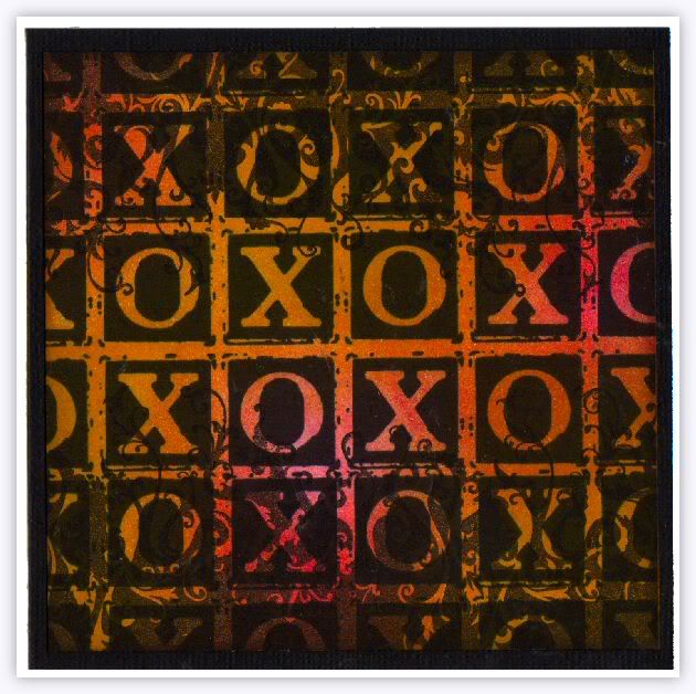
The theme for this week's Simon Says Stamp and Show Challenge is "anything goes"!  Which such an open-ended theme there's no excuse for entering this week, so give it a go! :)  My piece for the design team is this card, which (I hope) is bold and very graphic in style, that was my aim anyway!


After stamping with black Versafine ink, it was coloured with distress inks in Barn Door, Wild Honey and Frayed Burlap.  The stamps are from 2 of Tim Holtz's sets, Rockstar and From the Heart, and the main panel was matted onto black card then fixed to the white card front.


Our ever-generous sponsor Simon Says Stamp is offering a $50 gift voucher as the prize again this week! The winner will be chosen at random from those who enter the challenge, so why not give it a try? At the very least why not head over to the Challenge Blog to see how the other members of the design team have interpreted this weeks theme! :)

Monday, 18 July 2011

I've got the blues!

But not in a sad way :)

The theme for this week's Simon Says Stamp and Show Challenge is "some embossing".  As I've done quite a bit of heat embossing lately, I thought I'd use embossing folders for this one!

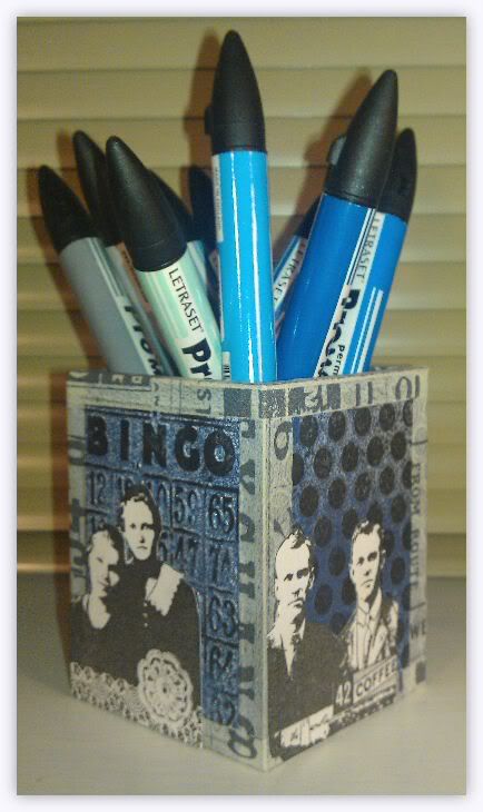
I'm going to make a set of these colour-themed boxes to store my Promarkers.  Obviously, this is the one I've made for the blue ones!  I also thought that as the pens would be brightly coloured I wanted to make the holder fairly monochromatic, to balance things out.

The main panels were embossed then spritzed with Denim colorwash spray and Heirloom Gold Perfect Pearls spray, before the raised parts were highlighted with a black versafine ink pad.  It was edged with tissue tape and monochrome images from the Artistic Outpost Generation Redux plate were added.

Our ever-generous sponsor Simon Says Stamp is offering a $50 gift voucher as the prize again this week! The winner will be chosen at random from those who enter the challenge, so why not give it a try? At the very least why not head over to the Challenge Blog to see how the other members of the design team have interpreted this weeks theme! :)

Monday, 11 July 2011

Fee, Fie, Faux Stitching!

The theme for this week's Simon Says Stamp and Show Challenge is "stitches - faux or otherwise".  My piece is very definitely in the "faux" department on this one - needle and thread are not my forte! :)

I cut this purse-shaped favour box from kraft cardstock, on my Cricut, then decorated it with stamped panels and stamped (and hand-drawn) faux stitching.  Finished it off by dying some cheesecloth using Adiriondack ColorWash sprays and using a strip from it to tie a bow closure.

Our ever-generous sponsor Simon Says Stamp is offering a $50 gift voucher as the prize again this week! The winner will be chosen at random from those who enter the challenge, so why not give it a try? At the very least why not head over to the Challenge Blog to see how the other members of the design team have interpreted this weeks theme! :)
Monday, 4 July 2011

A bit like flour!

(Flourish - geddit?)

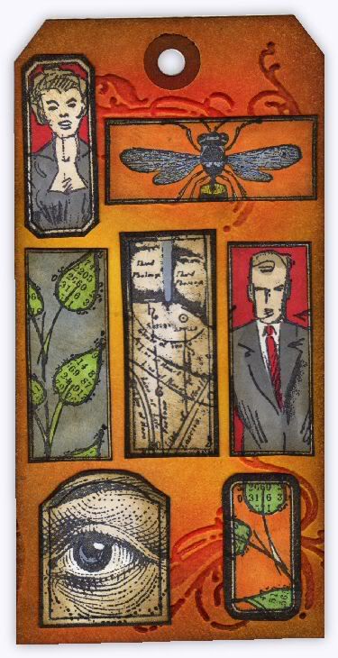
The theme for this week's Simon Says Stamp and Show Challenge is "a flourish".  On my tag I used the flourish from the French Connection Texture Fade set - although it's ATC sized, it can easily be used on larger projects such as this!

All the stamped images are inside panels stamped from the 7 Gypsies Rectangle set, which I've had for a while, but hadn't gotten around to using.  I have a feeling that today's project won't be the last thing I use them on! :)

Our ever-generous sponsor Simon Says Stamp is offering a $50 gift voucher as the prize again this week! The winner will be chosen at random from those who enter the challenge, so why not give it a try? At the very least why not head over to the Challenge Blog to see how the other members of the design team have interpreted this weeks theme! :)
Friday, 1 July 2011

Mmm, ch-ch, mmm, aah!

First of all, 50 bonus points to anyone who gets the reference in the title!  (I'm afraid it also means you're probably over the hill, like me! lol)

Here's another card I made while staying with Hels last weekend.  I've shown it twice cos there was a bit of discussion about which way up it should go.  My favourite is the first way, which is yours?  :)

Wednesday, 29 June 2011

The spooky heart card

I'm not long back from a few days spent staying with my friend Hels.  Apart from enjoying her wonderful hospitality, it was fun to do a bit of crafting using someone else's stamp collection for a change!  This card is one of the things I made while I was there.

The background is a piece from the "paint palette" page in Tim Holtz's Crowded Attic card stack.  I used my finger to rub white acrylic paint on it, making it thicker on the left edge and thinner as I moved right, until the paint stopped around 2/3 of the way across.  I then applied Fired Brick distress ink around the edges.

The central heart was stamped and masked, then the other two hearts were stamped.  All 3 were coloured with a red promarker and I dripped alcohol ink blending solution onto the central heart to make it's colour bleed out.  I masked off the area around the heart and stamped the image onto it.  The phrenology head was coloured yellow (somehow - I forget what I did, lol) and then Fired Brick was sponged onto it.  The eyes were highlighted with a white pen.  Elements were edged with a warm grey promarker and the mat was coloured with the same pen.  That's about it!  I didn't realise it was so complicated until I sat down to type this, lol!

Monday, 27 June 2011

A dream in blue

The theme for this week's Simon Says Stamp and Show Challenge is "a word".  I decided to limit this piece so that it only featured colour as part of the background.

The dream was stamped first, and embossed with clear powder.  I tapped the card very firmly before heating the powder, so that the resist technique would be patchy.  After colouring the background using Claudine Hellmuth paints applied with a baby wipe, I re-stamped the "dream" using black Archival ink, using a cut'n'dry nib to remove most of the black ink from the letters to give a more distressed effect.  The other images were stamped separately and then fixed in place.

Our ever-generous sponsor Simon Says Stamp is offering a $50 gift voucher as the prize again this week! The winner will be chosen at random from those who enter the challenge, so why not give it a try? At the very least why not head over to the Challenge Blog to see how the other members of the design team have interpreted this weeks theme! :)

Wednesday, 22 June 2011

That bluey whiteness you can only get with Daz!

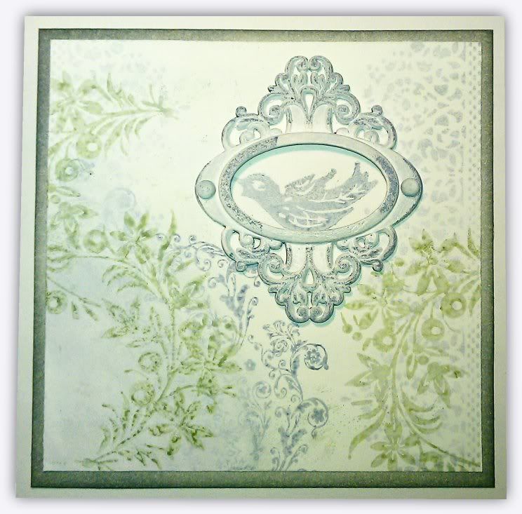
Another card where I've limited myself as to what I could use on it - in this case just white paint and 2 distress ink pads, weathered wood and bundled sage.  It took 3 coats of white acrylic to cover the metal embellishment, but I like how it turned out! :)  The photo is a bit dodgy, the mat around the edge is coloured with weathered wood, which is a pale blue, but it looks green in this photo!  Ah well, can't win em all! lol
Related Posts with Thumbnails