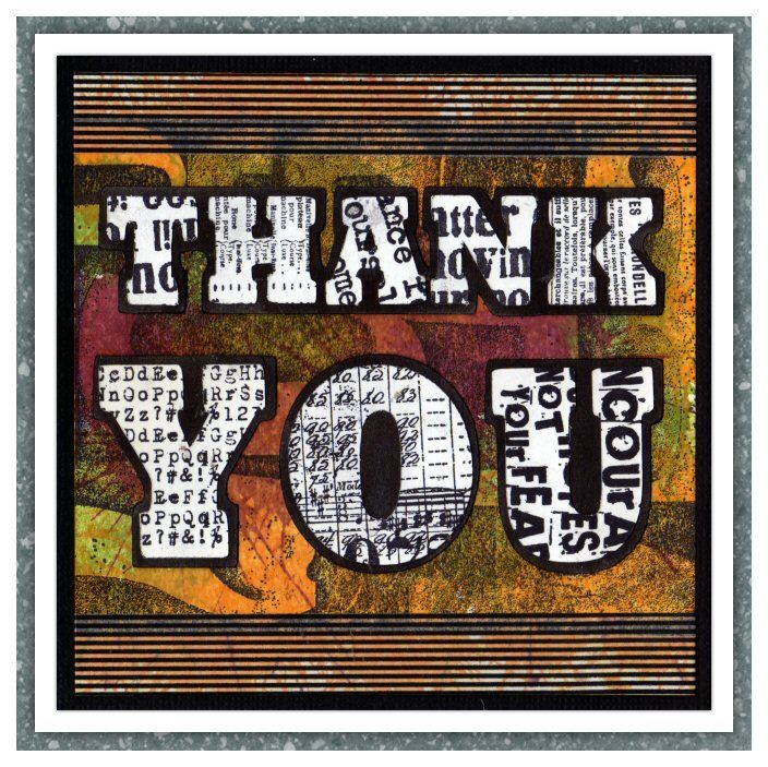
The theme over on the Simon Says Stamp and Show Challenge is "Thank You". I don't know about you, but I love typography - in fact, I'd say I looooooooove it, and I can spend hours sifting through font sites drooling over all the goodies that are available! I decided to make a bold typographic statement with this card, though it didn't quite turn out the way I had planned.
 Originally, I was going to colour the letters but after stamping them I decided I really liked the in-your-face starkness of the black and white characters and left them as they were. It also makes for a great contrast with the richly coloured background, so RESULT! :) In case you were wondering, the font is Rockwell Extra Bold, though I think I stretched it vertically a little before cutting it out on my Cricut.
 I started out by stamping the number background in black and then coloured it by playing whach-a-mole on my card with some colours of Distress Stains. After cutting out the letters and the shadow layer, I stamped on the letters with the Going Somewhere, Dance Card and Steampunk stamp sets. The whole thing was matted onto black card and then onto my white card blank. I think if you're going to say "thank you", you might as well say it as loudly as you can, and I think this card certainly does that! :)
 Supplies I used included:
Don't forget, Simon Says Stamp have a great Facebook page too! Check them out here!


Very striking Dan. The black and white lettering is very effective set against the warm tones of the background. Very eye catching. Tracy x
ReplyDeleteDan, your thank you card is awesome. Your signature bold colors! You're right...the "in your face" stark white and black letters really do make a statement! Love all of your stamping and the finished result! <3 Candy
ReplyDeleteI really like your bold card and that 'in-your-face' starkness... it rocks!
ReplyDeleteFab card Dan. I love the contrast between the background and the type.
ReplyDeleteToni xx
Stunning card! Love those bold letters! Hugs, Sandra
ReplyDeleteCooooeee ... Hey Dan loving this masculine/bold design, fabby. x
ReplyDeleteGreat card Dan...fabulous background and bold letters are striking!
ReplyDeleteFantastic Thank you card, Dan! I love the colors and all the texture you added :)
ReplyDelete*mwah*
Steph
Simon Says Stamp!